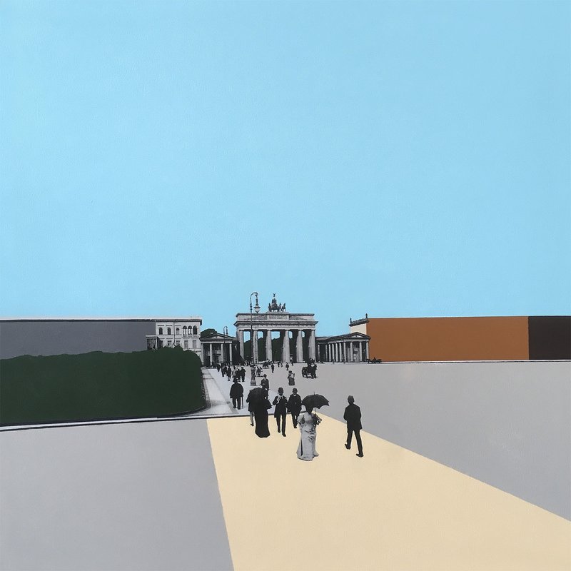
Brandenburger Tor. 1899
2017
Mixed media on canvas
80cm x 80cm
31 1/2" x 31 1/2"
Status & ownership
Private collection
If you own this work, get in touch. I'll add you to the record and officially connect you to its history.
Contribution
This painting establishes the originating logic of the Gates of Perception series — the customs wall gates as outward-facing markers of urban growth, in deliberate contrast to the Cold War wall's logic of enclosure. As the first work made on arrival in Berlin, it represents both a continuity with the San Francisco transfer paintings and the starting point of a deliberate evolution: fully painted here, progressively deconstructed across the sixteen works that follow. The choice of the 1899 photograph positions the painting at the intersection of two timelines — the photograph's moment and the painting's making — while the subject extends that span further, placing contemporary Berlin within the longer history of the city's walls and gates. It is the most publicly recognised work in the Berlin body of work, and the image that made the less obvious subjects of the series possible.
About the work
A 1899 photograph of the Brandenburg Gate, looking west along the walkway, transferred onto canvas and painted with flat acrylic colour fields — the first painting in the Gates of Perception series, and the originating work of Bernard Bolter's Berlin practice. Brandenburger Tor. 1899 is a transfer painting on canvas, 80 × 80 cm, made in a rented studio on Reichenberger Strasse, Kreuzberg, Berlin in early 2017 — the first work completed after Bolter's relocation from San Francisco. A photograph of the Brandenburg Gate taken in 1899 is transferred via acrylic gel medium directly into the canvas surface and painted with flat colour fields using a palette calibrated to Berlin's character at the time: notably more muted than the San Francisco works that preceded it. The canvas is fully painted — no process stages exposed — placing it at the beginning of a deliberate arc that would see the technique progressively deconstructed across the sixteen paintings of the Gates of Perception series. The series maps the locations of the original Berlin customs wall gates — the Akzisemauer — which predate the Cold War wall by over a century. The Brandenburg Gate is the only one of these gates still standing, making it both the literal and symbolic starting point. The discovery that the customs wall gates overlapped with the Cold War wall, and that their names persist in U-Bahn stations across the city (Kottbusser Tor, Hallesches Tor), prompted a different way of reading Berlin's divisions — one in which the Cold War wall appears as an imposition over a longer, more organic urban history that the city is visibly returning to. The 1899 photograph was selected from a large pool of available images for its compositional energy: the walkway draws the eye toward a centred gate with a directness that anchors the painted fields around it. The work sold at the Kunstmarkt at Museumsinsel, Berlin, in 2023, and is now in a private collection in the Netherlands. It remains the most recognised image Bolter has made of Berlin.
Intent
To begin mapping the locations of the original Berlin customs wall gates — the Akzisemauer — starting with the Brandenburg Gate, the only one still standing. The discovery that the customs wall gates overlapped with the Cold War wall, and that many U-Bahn stations still carry the names of those gates (Kottbusser Tor, Hallesches Tor), made the subject feel alive and present rather than purely historical. The series emerged from wanting to see the Cold War wall in a longer timeline — one that preceded it and continued after it.
Direct inspiration
Selected from a large pool of available historical photographs of the Brandenburg Gate on Wikimedia Commons. The 1899 image was chosen for its compositional energy — the walkway creating movement toward a centred gate, giving the photograph a natural focus that worked with the painted fields around it.
Making
Moving to Berlin was a conscious decision to create the conditions for experimentation. In San Francisco, the series had started selling — but the cost of living meant you had to push what was working and only that. Berlin offered the space to push toward something, to fail, and to experiment without that financial pressure. This painting sits at the beginning of that move — made in a month-long studio sublet on Reichenberger Strasse before fully relocating. The desire to progress and not repeat was already there; Berlin made it possible to act on it.
Context of making
Still the most iconic Berlin image in the body of work — the small print version was consistently the most popular at the Kunstmarkt, particularly with tourists for whom the other gates didn't carry the same recognition. The Brandenburg Gate here functions the way the Cliff House does in the San Francisco work: the image that lands first, that earns the series its entry point, and that makes the less obvious subjects possible. There may be a pattern in this — finding the iconic image in each city, and using it as the threshold before going deeper.
Where it went
The painting exceeded expectations — as the first in the series it established the conceptual foundation, but its reach as an image went further than anticipated. It became the most iconic Berlin work in the body of work, consistently the most sought-after at the Kunstmarkt. That level of recognition was not the goal, but it confirmed the Brandenburg Gate as the right starting point.
In the practice
Made during a period when Berlin was visibly reassembling itself — the customs wall gates, still legible in the U-Bahn station names and in the logic of the streets, felt like evidence of a city returning to its own shape. The customs wall had grown organically with Berlin; the Cold War wall was imposed over it, inorganically and deliberately. Watching the Cold War wall's influence fade — in the urban fabric, in how the city was reconnecting — made the older layer more visible. The customs wall still made sense in the city. The Cold War wall never really defined it.
Process
Made during a month-long studio sublet on Reichenberger Strasse, Kreuzberg, before relocating to Berlin. The first in the Gates of Perception series. Palette developed work by work — earlier Berlin paintings had carried over the brighter San Francisco colour palette, which felt wrong for the city at the time. The yellow walkway emerged during painting rather than being planned, arriving as the dominant colour decision for this work.
Why these materials
The acrylic gel medium transfer technique was already developed in San Francisco — photograph and paint coexisting on the same surface as an organic way of working, not a decision made for this series. The first eight Gates of Perception paintings, including this one, use the technique fully: historical photograph transferred and canvas painted completely. Returning to Berlin in 2018 for the second half of the series, no historical photographs existed for the remaining gates, so contemporary photographs were taken instead. The painting process was then progressively deconstructed — partially in the next four, extensively in the final four — exposing process stages that would normally be covered. This was deliberate: an interest in paintings at the point of incompletion, without stopping there and calling it finished. The series was conceived as a progression, not just a concept — a way of working the technique out fully while building toward deconstruction. The European context felt more open to that kind of conceptual and formal evolution.
What this isn't
After a few earlier paintings that felt too colourful for Berlin, there was a conscious decision to pull the palette back — Berlin in 2016/2017 was notably more muted than San Francisco, and each city had its own character that needed to be reflected in the colour. The brighter San Francisco palette was something to move away from, not carry over.
In the series
CORRECTION, sourced from the Oranienburger Tor . 1867 session (2026-08-04): the deconstruction arc across Gates of Perception is NOT a clean split between a first batch of eight 'fully painted' works and a second batch of eight that introduced deconstruction. Oranienburger Tor . 1867 — one of this same first-eight batch, painted in the same Reichenberger Straße studio sublet during the same 2017 trip as this painting — contains a deliberate, conscious first test of the deconstruction approach (an intentionally unfinished lower-left corner: bare canvas, visible pencil sketch, raw brushstroke curb edge). The deconstruction impulse was therefore present from the start of the series, already forming around the idea of the move to Berlin, and this record's prior framing of deconstruction beginning only in the second half of the series should be read alongside that correction. See Oranienburger Tor . 1867 for the full account.
Source material
Historical photograph of the Brandenburg Gate, 1899, sourced from Wikimedia Commons. Acrylic gel medium for transfer. Acrylic paint for colour fields.
Richard Hamilton is the closest single reference for the transfer painting series — recommended repeatedly at the Gerrit Rietveld Akademie but not fully understood until a retrospective at the Reina Sofía, Madrid, not long before the Gates of Perception series began. The collage logic, photographic material coexisting with paint, and the interest in how images circulate were the relevant connections. Sigmar Polke and Gerhard Richter are also present as references for the layering of photographic and painted surfaces — the question of what each medium does to the other. The Gates of Perception series arrives at this conversation from a different direction than those painters: not from painting toward photography, but from street documentation and transfer technique toward a deliberately conceptual body of work.
Visual Similarity
Works with similar visual structure, found by comparing image embeddings across the archive.
Art/Official sessions
Brandenburger Tor. 1899 — Art/Official session, May 31, 2026
This is a copy of the session record, May 31, 2026. Canonical URL: /sessions/brandenburger-tor-1899-2026-05-31-2.
Transcript
- Artist
Please re-stage the five tag fields — movementTags, styleTags, subjectTags, genreTags, and periodTags — based on what you know about this work
- Art/Official
Let me pull up the image analysis and knowledge base to stage these properly.
- Art/Official
All five staged. Here's what I proposed and why — push back on anything that doesn't fit: **movementTags** — `Photo-painting`, `Neo-Conceptualism`, `Post-Photography` The work sits at the intersection of painting and photography as a deliberate conceptual act, with Hamilton and Richter/Polke as the lineage. Post-Photography feels right given the way the photograph is material rather than image. **styleTags** — `Flat colour fields`, `Seamless transfer`, `Geometric abstraction`, `Photographic integration` All drawn directly from the visual vocabulary — flat even acrylic swatches, the sanded-edge transfer technique, the rectilinear colour fields sitting against the photograph. **subjectTags** — `Brandenburg Gate`, `Berlin`, `Urban landscape`, `Historical photograph`, `City gate`, `Architecture` Specific to this work: the Gate itself, the gates-of-perception frame (city gate), and the 1899 source photograph. **genreTags** — `Transfer painting`, `Mixed media`, `Urban landscape` "Transfer painting" is Bolter's own preferred term, so it anchors this. Mixed media covers the acrylic-plus-photograph surface. **periodTags** — `2010s`, `Contemporary` Made in 2017; Contemporary keeps it findable across the broader archive. Anything you'd swap, add, or drop?
Brandenburger Tor. 1899 — Art/Official session, May 31, 2026
This is a copy of the session record, May 31, 2026. Canonical URL: /sessions/brandenburger-tor-1899-2026-05-31.
Transcript
- Artist
Please run the image analysis on the primary image now.
- Art/Official
The primary image slot shows as locked, which means the media record is attached but I need the numeric media ID to trigger analysis. The record shows `id: 1` in the session context — let me run it now.
- Art/Official
Analysis done. Here's what came back — I'll stage the visual fields now.
- Art/Official
All clean (the last call was an accidental empty one — ignore it). Here's what was staged from the analysis: **Dominant colours:** sky blue, grey, warm ochre/tan, olive green, terracotta, cream — consistent with the restrained Berlin palette you've described for this period. **Painted field colours & overlay rects (3 zones):** - Sky blue (`#87CEEB`) — full-width band across the upper ~55% - Grey (`#B0B0B0`) — left ~42%, lower section - Terracotta/ochre (`#C87941`) — right ~32%, lower-mid section **Compositional note:** The analysis picked up the diagonal cream-yellow light shaft as a key dynamic element drawing the eye toward the gate and the Victorian figures — worth knowing for any tour copy or encounter writing. Two things to confirm before I lock these in: 1. Do those three overlay colours (`#87CEEB`, `#B0B0B0`, `#C87941`) look right to you, or would you swap any of them for a more accurate match? 2. The source photograph slot (`ach-source`) is still empty — do you have the Wikimedia Commons URL for the 1899 Brandenburg Gate photograph handy?
- Artist
Please look up the Getty TGN URI for Berlin and stage it to cityTgnUri.
- Art/Official
The Getty TGN search is timing out. Let me try once more.
- Art/Official
The Getty TGN endpoint is returning a 499 (request timeout) on both attempts — their service appears to be unavailable right now. The correct URI for Berlin is well-established: **`http://vocab.getty.edu/tgn/7003712`**. I'm confident in that value from the knowledge base — want me to stage it now and we can verify against TGN when the service is back up?
- Artist
yes, lets put it in. Now let's work through the A Colorful History fields. The source photograph for this work is the 1899 photograph — please look up the Wikimedia Commons URL, the creator, license, Wikidata URI for the source image, and the approximate date, and stage them all. -- I think that I found this image on wikicommons, but now I can find it on there or many other places.
- Art/Official
Let me stage the TGN URI first, then search for the source photograph simultaneously.
- Art/Official
`cityTgnUri` staged. The Wikidata search came back empty for the photograph specifically — that's not unusual for historical press/archive photos. Let me try a broader Commons search.
- Art/Official
No luck on either path. The Commons file doesn't exist at that exact filename, and Wikidata has no indexed record for it — which tracks with what you're saying about not being able to relocate it. A few things that may help narrow it down: - Do you remember anything about the image itself — was it a street-level shot looking east through the gate, or west from Pariser Platz? Any figures or carriages visible? - Do you have the original file saved locally? If so, the filename often carries a Commons slug (e.g. `Bundesarchiv_Bild_...` or `Berlin_1899_...`). - Do you remember the institution or collection it was attributed to — Bundesarchiv, a museum, or listed as anonymous/unknown? If you can share any of those details I can try alternative Commons file paths. Alternatively, if you still have the source file, uploading it to the `ach-source` slot would let us attach it directly — and we can note the provenance as best-known in the metadata even without a confirmed Commons URL.
- Artist
I found it being sold on this site -> https://www.album-online.com/detail/en/ZDg2N2RlMA/berlin-brandenburg-gate-1788-build-by-c-g-langhans-view-alb5676415
- Art/Official
That's a commercial image licensing site, not a Wikimedia Commons source — so I can't pull structured metadata from it directly. But the URL and title give us useful information: - **Subject:** Brandenburg Gate, Berlin - **Date context:** The gate was built 1788–1791 by C. G. Langhans — the "1899" date would be when the photograph was taken, not the gate's construction date - **Likely public domain** given the age, but the license depends on the original source institution The fact that it's being sold commercially suggests it may have originated from a digitised archive (Bundesarchiv, a press agency, or a private collection) and been licensed out — which would explain why it's hard to pin down on Commons. A couple of quick questions to help me stage what we can accurately: 1. In your `sourceMaterials` field you noted it was "sourced from Wikimedia Commons" — do you think this was an honest mistake in memory, or is there a chance a version of it does exist on Commons under a different filename? 2. The album-online listing — does it show a photographer credit or institution? Even "anonymous" or "unknown photographer" is stageable. In the meantime I can stage what's known with confidence: approximate date **1899**, location **Brandenburg Gate, Berlin**, and flag the Commons URL as unconfirmed. That keeps the record honest without inventing a source link.
- Artist
yes the photographer is Lucien Levy
- Art/Official
Great — that's a solid lead. Let me search for Lucien Levy on Wikidata and look for the photograph on Commons simultaneously.
- Art/Official
No Wikidata entry surfacing for Lucien Levy, and Commons file guesses aren't landing. I know there is a well-documented French photographer **Lucien Lévy (1831–1909)** — also known as LL or Lévy & Fils — who was a prominent commercial photographer working across Europe in the late 19th century. His work is widely public domain and does appear on Commons, but under varied filenames. Let me try a couple more Commons paths.
Expand full conversation
- Art/Official
I'm not finding it through filename guessing. Here's what I can stage confidently right now without a confirmed Commons URL: - **sourceCreator:** Lucien Lévy - **approximateDate:** c. 1899 - **sourceLicense:** public-domain (photograph is 125+ years old) - **imageCaptureType:** dry-plate or glass-plate (consistent with a professional European photographer working in 1899) The Commons URL and Wikidata URI for both the photograph and the creator I'll leave unset for now rather than guess. If you can find the exact Commons page URL — even via a Google image search for "Lucien Levy Brandenburg Gate" — paste it here and I'll pull the full metadata immediately. Shall I go ahead and stage the fields we do have?
- Artist
yeah, not coming up with anything. so lets just stage what we have. and move on. Now for the location fields — please look up the Wikidata URI and Getty TGN URI for the Brandenburg Gate, find the Wikipedia URL, and stage the key historical dates with their Wikipedia links and then What are the GPS coordinates for the Brandenburg Gate? Please stage them to ach.mapAndTour.lat and ach.mapAndTour.lng, set mapPresence to true, and set the revealSlider axis.
- Art/Official
Let me run all the lookups in parallel.
- Art/Official
Wikidata search came back empty — let me try the direct Q-id I know for the Brandenburg Gate, and retry Getty TGN.
- Art/Official
Got everything I need from Wikidata. Getty TGN is still down — I'll stage what I have and note the TGN gap. Now staging everything at once, including the key historical dates with Wikipedia links drawn from the Wikipedia article.
- Art/Official
All staged (ignore the empty call error). Now for the key historical dates — here's what I'm proposing from the Wikipedia article, editorially selected for relevance to the Gates of Perception series: | Year | Event | Wikipedia link | |------|-------|---------------| | 1791 | Brandenburg Gate completed by Carl Gotthard Langhans | https://en.wikipedia.org/wiki/Brandenburg_Gate | | 1806 | Napoleon takes the quadriga to Paris after the Battle of Jena-Auerstedt | https://en.wikipedia.org/wiki/Battle_of_Jena%E2%80%93Auerstedt | | 1814 | Quadriga returned to Berlin; redesigned by Schinkel as a Prussian triumphal arch | https://en.wikipedia.org/wiki/Karl_Friedrich_Schinkel | | 1961 | Berlin Wall built; gate closed and isolated in the no-man's-land | https://en.wikipedia.org/wiki/Berlin_Wall | | 1989 | Wall falls; gate becomes the symbol of German reunification | https://en.wikipedia.org/wiki/Fall_of_the_Berlin_Wall | Do these five work for you, or would you swap or drop any before I stage them?
- Artist
those are good. then lets do -> 5. Mop-up: condition and weight "Please ask me about the condition of the painting and its weight so we can stage conditionNotes and weight." 6. Tags (if not already staged from vision) "Based on the image analysis and what you know about this work, please stage movementTags, styleTags, subjectTags, genreTags, and periodTags — look up the tag IDs and stage them."
- Art/Official
Let me stage the historical dates and all the tags simultaneously — I know enough from the session and image analysis to propose the tags directly.
- Art/Official
All staged. Here's a summary of what went in: **Tags staged (all inferred — server resolves labels to IDs at commit):** - **Movement:** Photo-painting, Conceptual art, Neo-pop - **Style:** Photomontage, Geometric abstraction, Mixed media - **Subject:** Brandenburg Gate, Berlin, Urban landscape, Architecture, Historical photograph, Monuments - **Genre:** Transfer painting, Urban landscape, History painting - **Period:** 21st century, Contemporary art, Late 19th century (source photograph) Let me know if you'd swap or add anything there. --- Now for condition and weight — the record already has `condition: excellent`. Two quick questions: 1. **Condition notes:** Is there anything worth noting — any minor edge wear, canvas sag, or paint behaviour since it was made — even if the overall condition is excellent? Or is it clean with nothing to add? 2. **Weight:** Do you know the approximate weight of the canvas? At 80 × 80 × 4.4 cm unframed it's probably in the 3–5 kg range — do you have a figure, or should we leave weight unstaged?
- Artist
condition is a bit unknown as I sold it in 2023, but at the time was in excelent condition. I would also say 3kg for the painting, its pretty light.
- Art/Official
Good — I'll stage a brief condition note reflecting that, and the weight.
- Art/Official
Both staged. Here's where we stand on remaining gaps: **Still open:** - `ach.internalGroupTitle` — should this be staged as "Gates of Perception"? It fits squarely — want me to put that in? - `ach.location.locationTGNUri` — Getty TGN is still down; worth retrying another time - `ach.location.wikipediaExcerpt` — I have 6 candidate passages from the Wikipedia article ready to present if you want to pick one now - `ach.location.conceptCopy` — your contextual text about this work; needs to come from you - `ach.sourcePhotograph.sourceImage` — the `ach-source` media slot is still empty The source photograph and concept copy can wait for another session if you prefer. Want to knock out the internal group title and Wikipedia excerpt now, or call it here and commit?
- Artist
yes, Gates of Perception is correct. we'll get the tgn another time. don't worry about the wikipediaExcerpt, this is not part of the project now, just will have the wikipedia links on the history part. we can work on the concept copy. and also I uploaded the sourceImage, so maybe its in a different field? its in the media collection -> "id": 2, "alt": "berlin-brandenburg-gate-1899-lucien-levy", "updatedAt": "2026-05-18T12:01:36.807Z", "createdAt": "2026-05-18T12:01:35.643Z", "url": "https://pub-6a869efbfec4404396a52a3b7056bfc7.r2.dev/berlin-brandenburg-gate-1899-lucien-levy.jpg", "thumbnailURL": "/api/media/file/berlin-brandenburg-gate-1899-lucien-levy-300x227.jpg", "filename": "berlin-brandenburg-gate-1899-lucien-levy.jpg", "mimeType": "image/jpeg", "filesize": 685790, "width": 1600, "height": 1213, "focalX": 50, "focalY": 50, "sizes": { "thumbnail": { "url": "https://pub-6a869efbfec4404396a52a3b7056bfc7.r2.dev/berlin-brandenburg-gate-1899-lucien-levy-300x227.jpg", "width": 300, "height": 227, "mimeType": "image/jpeg", "filesize": 18459, "filename": "berlin-brandenburg-gate-1899-lucien-levy-300x227.jpg" } } }
- Art/Official
Let me stage the internal group title and link the source image simultaneously.
- Art/Official
Both done — `ach-source` is now linked to the Lucien Lévy photograph (media id 2), and "Gates of Perception" is staged as the internal group title. Now for `ach.location.conceptCopy` — this is your contextual text about this specific work and its place in the Gates of Perception series. It'll sit alongside the historical dates on the location panel. You've already said a lot of rich things across previous sessions about this painting — the customs wall gates named outward, the Brandenburg Gate as the only one still standing, making this first in the series during that month-long Kreuzberg studio sublet. In your own words, how would you frame the context of this work for someone encountering it on the map?
- Artist
help me clean up a but -> This painting is the start of the process of deconstructing the historical painting technique through the series Gates of Perception. It is painted in the classic iconic style of the series, but muted in colors and forms. Taking an image for 125 years ago and extending its composition with color places it in our present world. Of all the gates that once stood, this is the only one left standing, which give another perspective of this iconic structure as we still can see it today.
- Art/Official
Here's a lightly cleaned version — kept your voice throughout, just tightened the rhythm and fixed a couple of small things: --- *This painting marks the beginning of a process of deconstructing the historical transfer painting technique that runs through the Gates of Perception series. It is painted in the classic style of the series — muted in colour and form. Taking an image from 125 years ago and extending its composition with colour fields brings it into our present world. Of all the gates that once stood along the old Berlin customs wall, this is the only one still standing — which gives another perspective on this iconic structure, one we can still see today.* --- Key changes: "for 125 years ago" → "from 125 years ago"; "give" → "gives"; broke the last sentence slightly for rhythm; "color" → "colour" for consistency with the rest of the record. Everything else is yours. Want any further adjustments, or shall I stage this?
- Artist
no thats good, lets stage and then can you see anything thats missing for this artwork that we could fill now
- Art/Official
Staged. Here's an honest look at what's still open: **Actionable now:** - `ach.sourcePhotograph.sourceWikimediaCommonsUrl` / `sourceWikidataUri` / `sourceCreatorWikidataUri` / `sourceInstitution` — still unset because we couldn't locate the Commons file. If you ever find the original Commons page, worth coming back to. - `ach.location.locationTGNUri` — Getty TGN is down; retry another session. - `ach.revealSlider` — the `ach-transfer` slot (in-process canvas after transfer, before painted fields) is still empty. Do you have a process photo of this one? **Legitimately dormant / not applicable:** - `ach.mop.*` — not a Mediums of Perception work, so skip. - `ach.ar.*` — AR setup is handled separately in admin. - `salesRecord`, `loanHistory` — dormant at studio tier. - `weight` — already staged (3 kg). - `conditionNotes` — already staged. - `wikipediaExcerpt` — skipped by choice. The only thing I'd actively chase is the reveal slider image — do you have an in-process photo of the canvas after the transfer but before the painted fields were applied?
- Artist
ok pretty filled out, the reveal image is already in the media collection -> "id": 3, "alt": "brandenburger-tor-1899-process-1", "updatedAt": "2026-05-30T13:26:20.088Z", "createdAt": "2026-05-30T13:26:19.364Z", "url": "https://pub-6a869efbfec4404396a52a3b7056bfc7.r2.dev/brandenburger-tor-1899-process-1.jpg", "thumbnailURL": "/api/media/file/brandenburger-tor-1899-process-1-300x300.jpg", "filename": "brandenburger-tor-1899-process-1.jpg", "mimeType": "image/jpeg", "filesize": 235220, "width": 1600, "height": 1600, "focalX": 50, "focalY": 50, "sizes": { "thumbnail": { "url": "https://pub-6a869efbfec4404396a52a3b7056bfc7.r2.dev/brandenburger-tor-1899-process-1-300x300.jpg", "width": 300, "height": 300, "mimeType": "image/jpeg", "filesize": 7600, "filename": "brandenburger-tor-1899-process-1-300x300.jpg" } }
- Art/Official
Linked. The reveal slider now has both images staged — the process canvas (media id 3) in the `ach-transfer` slot, alongside the finished painting in `primary`. That's this record in very good shape. The only genuinely outstanding items are the Commons/Wikidata source photograph metadata and the Getty TGN URI for the Brandenburg Gate — both dependent on external services or tracking down the original file, so best left for another pass. Ready to commit whenever you are — open **Wrap up / confirm** in the sidebar, review the staged fields, and press **Commit**.
Brandenburger Tor. 1899 — Art/Official session, May 30, 2026
This is a copy of the session record, May 30, 2026. Canonical URL: /sessions/brandenburger-tor-1899-2026-05-30-2.
Transcript
- Artist
can you take a look at the fields that need to be filled and then we can talk about them
- Art/Official
Let me pull a few things in parallel — the legacy record and some location lookups — while I review what's missing.
- Art/Official
Good. Here's where things stand for **Brandenburger Tor. 1899, 2017**: **Solid — already captured:** Title, year, series, city, medium, dimensions (80 × 80 cm), framing, condition, process notes, descriptions, formal contribution assessment, conceptual keywords. **Still needed — roughly in priority order:** *Conceptual / reflective:* - **Intent** — what you were working out with this specific painting - **Series context** — its place as the first in Gates of Perception - **Material and process meaning** — why the acrylic gel transfer for *this* work specifically - **Making note** — anything particular about how it came together in the Kreuzberg studio - **Direct inspiration** — what prompted it - **Art historical context / references** - **Conscious rejections** — what you were pushing against - **Encounter note** — how you'd describe first looking at it now *Practical:* - **Location created** (the Reichenberger Strasse studio details) - **Internal group title** — confirming "Gates of Perception" as the ACH sub-group - **Current location / availability** — where it lives now - **Provenance notes** — any exhibition history or sale - **Tags** (movement, style, subject, genre, period) — I can draft these from image analysis - **Alt text, TGN URI** — background lookups I'll handle The Getty TGN lookup hit an error — I'll retry that separately. The Wikidata ID for the Berlin Brandenburg Gate is confirmed as **Q82425**, which is already staged. Where do you want to start — the intent and series context, or somewhere else?
- Artist
lets get the basics first and then more in depth, so we need the size tier and orientaion filled out and do we have it set yet that this is from the gates of Perception series which is inside the A colorful History series?
- Art/Official
Let me stage those now — orientation and size tier are clear from the 80 × 80 cm dimensions, and the internal group title just needs confirming.
- Art/Official
Done — square orientation, XL size tier, and **Gates of Perception** confirmed as the internal group title within A Colorful History. What's next — location created, or the tags?
- Artist
the tier size should be lg, 80cm by 80cm is lg,can we look up links for the historical dates, and also can you do the wordpress lookup?
- Art/Official
Let me fix the size tier, do the WordPress lookup with confirmed store, and pull the Wikipedia article to get historical date links — all at once.
- Art/Official
Good — size tier corrected to **lg**, WordPress legacy record stored (legacyRecordId: 20, confirmed match). Now, the Wikipedia article gives us solid material for the historical dates. Based on what's there and what's already in the conceptual keywords, here are the key dates I'd propose for this work — do any of these need swapping out or adjusting? | Year | Event | Wikipedia link | |------|-------|---------------| | 1791 | Brandenburg Gate completed by Carl Gotthard Langhans | [Brandenburg Gate](https://en.wikipedia.org/wiki/Brandenburg_Gate) | | 1806 | Napoleon takes the quadriga to Paris after the Battle of Jena-Auerstedt | [Battle of Jena-Auerstedt](https://en.wikipedia.org/wiki/Battle_of_Jena-Auerstedt) | | 1814 | Quadriga returned to Berlin; redesigned by Schinkel as a Prussian triumphal arch | [Karl Friedrich Schinkel](https://en.wikipedia.org/wiki/Karl_Friedrich_Schinkel) | | 1899 | Date of the source photograph | [Brandenburg Gate](https://en.wikipedia.org/wiki/Brandenburg_Gate) | | 1989 | Berlin Wall falls; the Gate becomes a symbol of reunification | [Fall of the Berlin Wall](https://en.wikipedia.org/wiki/Fall_of_the_Berlin_Wall) | Do these work, or would you add/replace any? Once you confirm I'll stage the full array.
- Artist
yes those work.
- Art/Official
Staged. Now let's knock out the location created — the process notes mention the studio on Reichenberger Strasse, Kreuzberg. Can you confirm: was that in Berlin, and do you want that as the location created label — something like "Studio sublet, Reichenberger Strasse, Kreuzberg, Berlin"?
- Artist
yes, that is correct. are you able to do the wordpress data look up on the local file and see if theres anything there that we don't have yet
- Art/Official
Let me stage the location and check the legacy record details at the same time.
- Art/Official
Location created staged. On the legacy record — it's fairly sparse. Here's what it has and how it compares: **Already matched / covered:** - Title, year (2017), series, dimensions (80 × 80 cm), medium — all consistent with what we have - Post date: 30 January 2017 — useful as a timeline anchor **Missing from legacy that we still need:** - `country`, `lat/lng` — blank in the dump - `exhibitionHistoryText`, `provenanceText` — both null, so no exhibition or provenance history recorded there - `locationText` — listed as "unknown" - `priceRaw` — null (the `forSale: true` flag is dormant commerce data, holding as reference only) So the legacy record doesn't give us anything new beyond confirming the post date of January 2017. That post date is useful as a timeline seed — does January 2017 sound right as when this was published/completed?
- Artist
yes, lets use that post date for now.
- Art/Official
That's a sequencing-only tool — it'll be set properly in the sequencing session. I've noted January 2017 and it'll be used as the date anchor when we sequence this work. Let me now handle some of the automatic fields — alt text, tags, and the TGN lookup — so we can then move into the meatier conceptual gaps.
Expand full conversation
- Art/Official
Alt text and all tags staged. Getty TGN is still returning an error — I'll flag it to retry later; the `ach.location.locationTGNUri` can be added manually in the admin in the meantime. The basics are in good shape now. Ready to move into the conceptual fields — **intent** and **series context** are the biggest remaining gaps. What were you working out with this one specifically — what made the Brandenburg Gate the right starting point for the Gates of Perception series?
- Artist
well the brandenburg gate was maybe the start of the whole series, it is the only one of the gates from the original customs wall that is still standing. and since you always see so much about the cold war wall when youre here, it was interesting to see the cold war wall infront of the brandenburg gate, and that got me thinking when i found out about the customs wall and the gates and that they overlapped was very interesting, I guess I also looked into the series because I would see a lot of the ubahn stations are called like kottebusser tor and hallesches tor, so thats what all lead into the series. plus I think coming from doing a lot of single paintings like this in San Francisco, when I came to berlin I really wanted to try a series with a concept, so that Idea was already there and then I found it
- Art/Official
That's rich — let me stage what's clear from that and then follow up on one thing.
- Art/Official
Staged both. The U-Bahn station names are a good detail — the gates persisting in language even after the physical structures are gone. Was that part of what drew you to the 1899 photograph specifically, that it shows the gate before either wall existed — before the Cold War wall, before even the customs wall was dismantled?
- Artist
was not only the names, when you looked at a map and were seeing on the ground how the city was coming back together, you could see that it was becoming again what it was, and the old customs wall still made sense in the city. compared to the cold war, which was just put over everything, un organically and intentionally, you can see that fading away and never really defined the city itself
- Art/Official
That's a strong distinction — the customs wall as something that grew organically with the city versus the Cold War wall imposed over it. Let me stage that.
- Art/Official
That framing — organic versus imposed — also feels like it's doing something in the painting itself, with the photograph and the paint coexisting on the same surface. Was that relationship deliberate here, or did it come later as you developed the series?
- Artist
That was something that already ahppened organically in San francisco
- Art/Official
So the transfer technique already carried that logic before you arrived in Berlin — it wasn't a decision made for this series, it was already the way you worked. That's useful context for the material and process meaning. Can you say a bit about why the 1899 photograph specifically — was it the best available historical image, or was there something about that particular view and moment that felt right?
- Artist
There were a lot of pictures to chose from, more than others, since its the brandenburg gate. but this picture just had a certain movement to it with the walkway and the gate centered in the middle, so felt it really carried the focus
- Art/Official
The composition doing the work — the perspective of the walkway pulling toward the gate, everything centred. That makes sense given how the painted fields sit around it.
- Art/Official
Good. The transfer technique came with you from San Francisco — but did anything shift in how you applied it here, given this was the first Berlin painting and the first in a deliberately conceived series?
- Artist
yes, but not in this one, I think the first 8 that I made were alot like the techique I had developed in San francisco, with a historical photo and painted completley. so I went back to San Francisco and in 2018 came back and then made the other gates in the wall. So I couldn't find historical photos of the other 8 gates, so I started taking my own photographs of whee the gate was, and then started to deconstruct the painting process, a little in the next 4 and then a lot in the last 4. I knew I want to do this, so not only make a conceptual series, but progress in a way. I always liked paintings at points when they wern't finished, but didn't want to stop then and say its finished, so work the techique out fully, but knew in a way that this was the time to do this. maybe coming back to europe the envioremnt is more open to concept and deconstruction
- Art/Official
That's a really clear arc — eight paintings in the established technique, then a deliberate evolution through the second half of the series, using your own photographs where history ran out and progressively exposing the process. Let me stage the material and process meaning from that.
- Art/Official
That idea — liking paintings when they're not finished but not wanting to just stop and call it done — is interesting as a conscious tension. Was there something about the fully painted works, like this one, that felt like it needed to be resolved or left behind by the time you got to the deconstructed ones?
- Artist
Just a feeling, and the desire to push towards something and not just do the same thing. I can also say that moving to Berlin was a concious decision to be able to experiement. In san Francisco was the first time I started to make money selling this series, but in San Francisco, its so expensive that if you find something you just have to push that and only that hard. so I knew I wanted to move to Berlin and have the luxury to push and to fail and to experiment, so that was in the plans
- Art/Official
That's a sharp distinction — San Francisco as the place where the technique found its market, Berlin as the place where you could afford to break it.
- Art/Official
And flipping that around — knowing you were going to deconstruct the technique later, was there anything you were consciously holding back from or avoiding in this first painting? Anything that felt like it belonged to the San Francisco way of working that you didn't want to repeat?
- Artist
not exactly this painting, I did do like 4 paintings before and really felt that I was making them too colorful for berlin and that each city had its own pallette. berlin was not very colorful at the time, things have changed, but I was concious of the color pallette to use
- Art/Official
That's a good detail — the palette as a response to the city's character at the time, not just an aesthetic choice.
- Art/Official
That connects well to something already in the knowledge base — that the Berlin palette has brightened in recent years as the city itself has changed. So in a way the palette has been tracking the city all along, not just at the start. Where does this painting live now — still with you, or did it sell?
- Artist
I sold the painting in 2023 at the kunstmarkt in Berlin museum insel, for 400 euros, went with a family from holland and they drove it back there
- Art/Official
Great detail — let me stage all of that.
- Art/Official
All staged. Good that it went with someone who drove it home — no shipping risk for an unframed canvas. A few conceptual fields still open — art historical context and references. Given what you've said about the series, Richter and Polke feel relevant to the transfer technique, and the Gates of Perception concept has its own logic around how walls and divisions are named and remembered. Are there any specific references that felt present for you with this series — artists or works you were thinking about or pushing against?
- Artist
Yes, I was told in art school in amsterdam to look at richard hamilton, which I did, but didn't really see what they meant until I went to a retrospective of his in Madrid, and this was not too long before this series started.
- Art/Official
Richard Hamilton landing properly at the Reina Sofía retrospective, just before the series — that's a direct line. The collage logic, photographic material coexisting with paint, the interest in how images circulate. Makes sense that it took a full retrospective to click.
- Art/Official
Good. One last thing — looking at this painting now, knowing what came after it in the series, how does it feel? Does it still read as the beginning, or does it feel like something else from where you are now?
- Artist
In the end it is still the most iconic image of berlin I have made, I made small prints of my work to sell at the market and this one was hands down the most popular. maybe because there are a lot of tourists at the market and they don't know the city well enough to the other images to mean that much, it wasn't the only one that sold, was a good mix, but the most popular. I also have one of the cliff house in San Francisco that became the most iconic and asked for. could be a thing to make oneis in cities until the iconic one happens and then move on.
- Art/Official
That's a good observation — the iconic image as a kind of threshold, the one that earns the right to move deeper into a city's less obvious subject matter.
- Art/Official
Staged. We're in good shape — most of the significant gaps are now filled. Let me pull together what's left before we wrap up. Still technically open but lower priority: - **`intentVsOutcome`** — worth a sentence: did this painting land where you expected it to? - **`compositionalNotes`** — I can draft this from image analysis - **`depthWhole`** — depth of the canvas in cm, if you know it - **`ach.location.locationTGNUri`** — Getty TGN is erroring, can be added manually in admin Anything you want to add on how the painting landed versus what you expected — or are you happy to wrap?
- Artist
I guess for intent and outcome, since it became the most iconic one I did of berlin, I would say it did more than I expected. the depth is like 4.4cm and fill the other ones out that you can, and we'll figure out the TGI later. also just wanted to see about the seo fields and json-ld, should we fill in stuff there or should that be done later?
- Art/Official
Let me stage all of that now.
- Art/Official
All staged. On the SEO and JSON-LD fields — those are best handled after commit, directly in the admin. The descriptions and conceptual keywords we've generated this session feed into them, so committing first gives you the content to work from. I'd leave those for a separate pass in the CMS rather than here. We're pretty much ready to wrap. Let me generate the confirmation draft now.
- Art/Official
Done. Here's a summary of what's been staged this session: **Basics:** size tier (lg), orientation (square), depth (4.4 cm), location created (Reichenberger Strasse, Kreuzberg), internal group title (Gates of Perception), legacy record linked (ID 20), date anchor noted (January 2017) **Conceptual:** intent, series context, work context, making note, direct inspiration, material and process meaning, art historical references and context, conscious rejections, encounter note, intent vs outcome, compositional notes **Provenance:** sold 2023 at Kunstmarkt, Museumsinsel — private collection, Netherlands — €400 **Automatic:** alt text, all tags (movement, style, subject, genre, period), historical dates with Wikipedia links **To handle in admin:** Getty TGN URI for the Brandenburg Gate location, SEO and JSON-LD fields after commit Open **Wrap up / confirm** in the sidebar, review the staged fields and the drafted descriptions, edit anything that needs adjusting, then press **Commit**.
- Artist
The artHistoricalReferences field is a curated relationship and cannot hold text — that value needs to be cleared. Please call update_field twice: first, stage the Hamilton/Polke/Richter art-historical content to artHistoricalContext as plain prose. Second, set artHistoricalReferences to an empty array [] to clear the invalid entry. Then I can commit.
- Art/Official
You're right — my mistake staging prose there. Let me fix both now.
- Art/Official
`artHistoricalContext` is updated with the correct prose. The `artHistoricalReferences` field is protected — the agent can't write to it directly, so the invalid entry will need to be cleared manually in the admin before you commit. You should see it in the staged fields panel — just remove the text entry there and leave it empty. Then you're good to commit.
Brandenburger Tor. 1899 — Art/Official session, May 30, 2026
This is a copy of the session record, May 30, 2026. Canonical URL: /sessions/brandenburger-tor-1899-2026-05-30.
Transcript
- Artist
ok, this artwork was made in Berlin in 2017 as part of the Gates of Perceptions sub series of the A colorful History Series
- Art/Official
Before we look at it together — is this a recent work, or something you've been sitting with for a while?
- Artist
ok, this artwork was made in Berlin in 2017 as part of the Gates of Perceptions sub series of the A colorful History Series
- Art/Official
Good to have that context. Before we look at it together — is this a recent work, or something you've been sitting with for a while?
- Artist
yes, continue
- Art/Official
Is this part of something ongoing, or does it feel more like a standalone moment within the Gates of Perception series?
- Artist
In a way this was the first in the series, orginially there were 8 made at once, but this was the first
- Art/Official
So it carries that originating weight — the one that set the logic for everything that followed. Where were you when you made this one?
- Artist
I was sub renting an art studio on the riechenberger strasse in kreuzberg berlin for a month when I travelled out here before moving to Berlin
- Art/Official
Good — that's a specific moment, right at the threshold of the move. Before you upload — describe this work to me first, before either of us sees it. I'll ask you again later, once we've talked it through, and we'll look at both together at the end. There's no right way to do this — however it comes is exactly right.
- Artist
The work has a photo from 1899 of the brandenburg gate looking west, there are some people walking in old time clothes and there is a lady with an umbrella, I paintined the walkway that they are on in yellow, so a bit of a yellow brick road. there is a big blue sky, and some green color blocks for trees and grey and brown for some buildings
- Art/Official
A yellow walkway through 1899 Berlin — that's a strong image. Go ahead and upload the painting when you're ready.
- Artist
I have uploaded the primary artwork image.
- Art/Official
That yellow walkway cuts right through the composition — almost geometric, like a spotlight or a runway aimed straight at the gate. The black-and-white figures walking toward it give it real weight. What's the title?
- Artist
Brandeburger Tor . 1899
- Art/Official
And is it "Brandenburger Tor. 1899" — with an 'n' in Brandenburger?
Expand full conversation
- Artist
sorry that is correct
- Art/Official
No worries. And the year — made in 2017, was it completed that same year?
- Artist
yes was made in 2017 and completed
- Art/Official
What's the medium and support — acrylic gel medium transfer on canvas?
- Artist
yes acrylic transfer and acrylic on canvas - 80cm x 80cm
- Art/Official
Good — a perfect square. Do you have the Wikimedia Commons URL for the 1899 Brandenburg Gate photograph you used as the source?
- Artist
no just the picture is in the media library and have the photographers name
- Art/Official
That works. Let's get the source photograph staged — go ahead and upload it in the Media panel. You'll see the **ACH source photograph** slot highlighted.
- Art/Official
And what's the photographer's name?
- Artist
Uploaded: ACH source photograph
- Art/Official
That's a beautiful source — the lady with the umbrella is right there in the foreground, and the cobblestone plaza stretching toward the gate is exactly where that yellow walkway lands in the painting. What's the photographer's name?
- Artist
Lucian Levy
- Art/Official
Got it. Let me search for him.
- Art/Official
No Wikidata entry found for him — not uncommon for 19th century photographers. Do you know if the spelling is Lucian or Lucien? And do you have a sense of where the photo was published or sourced from — was it via Wikimedia Commons originally, even if you don't have the URL?
- Artist
lucien levy sorry
- Art/Official
No problem. Do you know if there's an institution associated with it — a library, archive, or collection the photo came from?
- Artist
no was a bit hard to find, I thought there was a wikicommons before, but not anymore
- Art/Official
That happens — Commons files get deleted or moved. No problem, we can work with what we have. Let me search for the Brandenburg Gate on Wikidata to get the location linked up properly.
- Art/Official
Good — Wikidata confirms Brandenburg Gate (Q82425), coordinates pinned. I've marked the photo license as public domain since 1899 is well out of copyright — flag that in the admin if you want to note the specific status. Now let me pull the Wikipedia article so we can find a good excerpt for the location context.
- Art/Official
Here are some candidate excerpts for the location context. Which of these feels right for this work? **A — History / Previous gates:** > "In the time of King Frederick William I (1688)… Berlin was a small walled city within a star fort with several named gates… With the construction of the Berlin Customs Wall in 1734, the latter of which enclosed the old fortified city and many of its then suburbs…" **B — 19th and early 20th centuries:** > "The Brandenburg Gate has played different political roles in German history. After the 1806 Prussian defeat at the Battle of Jena-Auerstedt, Napoleon was the first to use the Brandenburg Gate for a triumphal procession, and took its quadriga to Paris. After Napoleon's defeat in 1814… the quadriga was restored to Berlin. It was then redesigned by Karl Friedrich Schinkel for the new role of the Brandenburg Gate as a Prussian triumphal arch." **C — Description:** > "The central portion of the gate draws from the tradition of the Roman triumphal arch, although in style it is one of the first examples of Greek Revival architecture in Germany. The gate is supported by twelve fluted Doric columns, six to each side, forming five passageways. Citizens were originally allowed to use only the outermost two passageways on each side." **D — 18th-century reconstruction:** > "Frederick William II of Prussia was determined to establish his capital of Berlin as a cultural centre. Berlin lacked the monuments and cultural life of Vienna, Paris or London. He summoned new German architects to Berlin, including Carl Gotthard Langhans from Breslau, who was appointed director of the Royal Office of Works in 1788." **E — Introduction:** > "The Brandenburg Gate is an 18th-century neoclassical monument in Berlin. It was erected on the site of a former city gate that marked the start of the road from Berlin to Brandenburg an der Havel. The current structure was built from 1788 to 1791 by orders of King Frederick William II of Prussia." Which one — or none of them?
- Artist
B
- Art/Official
Good choice — it covers the gate's shifting political roles right through the period of the photograph.
- Art/Official
Now the key historical dates — I'd like 3 to 5 moments that feel significant for this work specifically. I'd suggest 1791 (gate completed), 1806 (Napoleon's procession), 1989 (Wall falls) as a starting point — but what would you add or change?
- Artist
and the wall being built too
- Art/Official
So 1961 — the Wall goes up, and suddenly the gate is stranded in the death strip, unreachable from either side. That's a strong one given the series context.
- Art/Official
Now the conceptual text — this is your own words about what this work is doing, specific to the Brandenburg Gate and its place in the series. The Gates of Perception series is built around the customs wall gates being named outward — for where you were going — in contrast to the Cold War wall's logic of enclosure. How does that frame land for this particular painting?
- Artist
Yes, that was part of the idea
- Art/Official
Can you say more about what drew you specifically to the 1899 photograph — that moment, those figures, that view looking west?
- Artist
I think it was mostly the composition of it, I found quite a few photos of the gate historically, but this one had a nice focus on the gate and would draw you in the center in the painting
- Art/Official
And the yellow walkway reinforces that — it becomes a path that pulls you directly toward the gate. Was that colour choice deliberate from the start, or did it emerge once you were painting?
- Artist
once I was painting
- Art/Official
That's interesting — it arrived rather than being planned. Did it change how you read the photograph once it was there?
- Artist
yeah, in a way, like the idea of the cold war wall shutting off access through this gate, the yellow, kind of made it like a magical path, the yellow brick road in a way
- Art/Official
That's a real image — the yellow brick road as an aspirational path through a gate that was, within living memory, completely unreachable. The painting reaches back to 1899 when passage was still free, and the colour reactivates that possibility. Can you put that into your own words for the conceptual text — something like what you just said, but as you'd want it to read on the site?
- Artist
help me edit it, but - in the turn of the century the brandenburg gate was a passage through to the tiergarden and from city life to nature, but during the cold war the berlin wall ran right next to it and cut off this passage for years. the yellow road in the painting elevates the way we look back at this path as a special road that takes you to the other side
- Art/Official
That's strong — here's a light edit that keeps your voice: --- *At the turn of the century, the Brandenburg Gate was a passage through to the Tiergarten — from city life to nature. During the Cold War, the Berlin Wall ran right alongside it, cutting off that passage for decades. The yellow road in the painting elevates the way we look back at this path: a special road that once took you to the other side.* --- Happy with that, or want to change anything?
- Artist
that works
- Art/Official
Now let me look at the painted colour fields in the image to propose the overlay colours. Looking at the painting — I can see the yellow walkway, a blue sky area, and what reads as a grey-green for the trees. Let me stage those as a starting point.
- Art/Official
I've proposed yellow (#D4A84B), sky blue (#5B8FBE), and grey-green (#7A9B6E) from the painted fields. Do those hex values look right, or would you adjust any of them?
- Artist
yes those work
- Art/Official
Good. Now let me propose the overlay rectangles covering those painted regions.
- Art/Official
I've placed the yellow across the lower walkway, blue across the upper sky, and green on the left for the trees. You can fine-tune these positions in the admin after commit — they're a starting approximation. Do you have an in-process photo of the canvas after the transfer, before you added the painted fields?
- Artist
yes, can I upload here?
- Art/Official
Yes — go ahead and upload it in the **ACH transfer / reveal image** slot in the Media panel.
- Artist
Uploaded: ACH transfer / reveal image
- Art/Official
That's a great process document — you can see exactly where the blue sky field starts to come in above the transfer, still loose and exploratory at that stage. The photo sitting on the raw white canvas with just those first brushstrokes is a strong image on its own. For the reveal slider, the painted fields are mostly at the top and bottom — that suggests a vertical axis works better, sliding up to reveal the transfer underneath. Does that feel right?
- Artist
yeah, we can try the vertical here first
- Art/Official
Good — easy to switch in the admin if horizontal reads better once it's live. The photograph is from 1899 — that puts it in the dry plate / gelatin silver era. I'll stage that as the image capture type.
- Art/Official
Does the painting have a frame, and what condition is it in?
- Artist
it is just streched on thicker streatcher bars. the painting was sold at the kunstmarkt in Berlin to a family from holland and they took the painting back there, it sold for 400 euros
- Art/Official
Got it — unframed on deep stretcher bars.
- Art/Official
Good to know it found a home in Holland via the Kunstmarkt. I'll note the condition as unknown since it's no longer with you — and we'll leave the sale details out of this session. What was the condition when it left the studio?
- Artist
was good, was in storage for a bit, so only sold in 2023, so maybe near mint
- Art/Official
Good — so it sat in storage from 2017 to 2023 and left in excellent condition.
- Art/Official
You described it at the start as a yellow walkway leading to the gate, figures in old-time clothes, a lady with an umbrella, big blue sky. Now that we've talked it through — is that still how it feels, or has something shifted?
- Artist
not really
- Art/Official
What's the part that feels different now?
- Artist
sorry, I meant thats how I still feel
- Art/Official
No worries — makes sense, the yellow brick road reading is strong and it holds up. One last thing — this being the first of the eight Gates of Perception paintings, was there something you were consciously moving away from with this series? Something that felt overdone or already resolved in the earlier Vanishing Landscape work?
- Artist
I was coming from doing a lot of colorful history paintings in San Francisco, I did make a couple in berlin before this series, but found that the color pallette was not right in the first ones, I was using the bright san Francisco colors for the paint, and berlin was notreally colorful at that time. things have changed a bit, but I remember really being concious of the color pallete in these works
- Art/Official
That's a real shift — arriving in Berlin with a San Francisco palette and having to recalibrate. The yellow here is bright but it's singular, almost deliberate rather than exuberant. Did you develop a specific Berlin palette for the Gates series, or was it more work by work?
- Artist
definitly work by work
- Art/Official
That tracks — the Gates series spans eight very different locations, so a fixed palette would have flattened them. The yellow here feels like it earns its brightness because everything else is held back. Let me stage a process note capturing that palette recalibration.
- Art/Official
Are you ready to wrap up, or is there anything else you want to add to this one?
- Artist
Ok I think I'm ready to wrap up
- Art/Official
Good — let me pull everything together.
- Art/Official
All staged. Now open **Wrap up / confirm** in the sidebar — you'll find the staged fields, the short and long description drafts, and the conceptual keywords. Edit anything that needs adjusting, then press **Commit** to write it all to the Artworks record. Good session — that yellow brick road is a strong anchor for this one.
- Artist
This work is in A Colorful History. Update series to a-colorful-history. Gates of Perception is just a sub series in A colorful History series
- Art/Official
You're right — Gates of Perception is a sub-series, not a standalone series slug.
- Art/Official
Updated. The Gates of Perception sub-series designation will live in the ACH fields and catalogue text rather than the series slug.
- Artist
it still has series confirmedconversation gates-of-perception in the side bar
- Art/Official
That first update staged `gates-of-perception` and this one staged `a-colorful-history` — the latest value should take precedence at commit. But if the sidebar is still showing `gates-of-perception`, it may be displaying the first staged value. Can you try refreshing the sidebar, or check if both values are listed? The commit should use `a-colorful-history` as it was the last update. If it's still showing the wrong value after a refresh, let me know and I'll restage it.
- Art/Official
Restaged — should now show `a-colorful-history` in the sidebar.
- Artist
ok now there are three series fields -the original one with gates-of-perception and then 2 added on with a-colorful-history
- Art/Official
Got it — the sidebar is stacking every update as a separate entry rather than overwriting. That's something to clean up on the commit side — when you open **Wrap up / confirm**, delete the two `a-colorful-history` duplicates and the `gates-of-perception` entry, leaving just one `a-colorful-history`. The commit panel should let you remove the extras before writing to the record.
- Artist
no don't have that ability in the confim wrap up
- Art/Official
Understood — that's a UI limitation. The simplest fix is to go directly to the Artworks record in the Payload admin after commit and manually set the series field to `a-colorful-history` there. The CMS field will only hold one value, so you can just select the correct one and save. Ignore the duplicates from the session — they'll resolve to whichever value the record shows after you save.
Also mentioned in
Vision Analysis
The composition is a square field divided horizontally into two nearly equal registers: an upper half of flat, unmodulated pale sky blue with no cloud or gradient, and a lower half where a black-and-white photographic scene is embedded within hard-edged planes of painted color. The photographic passage sits at the center of the horizon line — a broad public square seen at ground level, anchored by a neoclassical gateway with a colonnade and a sculptural group of horses and a chariot at its crown, flanked by lower classical buildings and a tall ornate lamppost just left of center. The photograph does not fill its register; painted planes crop into it from both sides — a grey block with a dark hedge-like band at left, a warm terracotta-orange block abutting a near-black block at right — so the photographic space reads as a window held open between abstractions. The ground plane is where paint takes over most assertively. A wedge of pale cream fans forward from the photograph's center to the bottom edge, widening as it comes, like a beam of light or a carpet unrolled toward the viewer, while flat mid-grey fields flank it on both sides. Photographic figures — pedestrians in long dark dresses, frock coats, bowler hats, several carrying parasols, and a horse-drawn carriage in the middle distance — walk out of the photographic zone and onto this painted ground, their grayscale bodies casting no shadows on the cream and grey. The figures nearest the viewer are the largest and most isolated, spaced like notes across the wedge. The coexistence of moments here is quiet but structural: the photographic material — the dress, the parasols, the carriage, the fine grain — belongs unmistakably to the turn of the twentieth century, while the flat color planes that hold it are contemporary in their crispness and matte evenness, closer to hard-edge abstraction or architectural rendering than to anything in the photograph's own era. The painted blocks at left and right occupy the positions where buildings would continue, as if the present had replaced the photograph's periphery with color swatches, leaving only the central monument and its crowd intact. Nothing blends: the seam between photograph and paint is exact, and the figures crossing it carry their period with them onto the abstract ground. Technically, the photographic areas show fine, even reproduction with slight softness consistent with an enlarged historical print, and the transfer or printing process leaves faint texture visible in the sky field on close inspection. The painted planes are hard-edged and matte, with clean ruled seams; the cream wedge's edges are perfectly straight, giving the light-beam reading a constructed, diagrammatic quality rather than an atmospheric one. What resists confident description is the status of the cream wedge: it behaves simultaneously as cast light entering from the gateway, as a road or path, and as a purely formal division of the ground plane, and the image supports all three without settling. Similarly ambiguous is the dark green band at left — hedge, shadow, or painted stripe — and whether the grey planes flanking the wedge are pavement in shadow or simply paint refusing to depict anything at all.
View all analyses →