- Artist
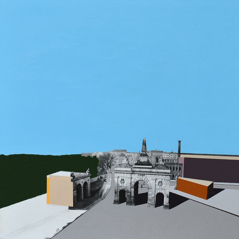
That's the painting
- Art/Official
Good. Let's nail down the small facts before we go deeper. What year was this painted?
- Artist
2017
- Art/Official
Same year as Brandenburger Tor, then. What are the dimensions?
- Artist
Yes, the first 8 paintings of the gates of perception were all painted at the same time
- Art/Official
Good to know — that's useful context for the series arc. What are the dimensions of this one?
- Artist
80cm x 80cm
- Art/Official
Same square format as Brandenburger Tor too. Same medium — acrylic gel medium transfer and acrylic paint on canvas?
- Artist
Yes
- Art/Official
Good — small facts locked in: 2017, 80×80cm, mixed media transfer on canvas, painted during the same batch as the first eight Gates works, in the Reichenerger Strasse studio. Now the deeper part. Since Oranienburger Tor was demolished in 1867 and doesn't survive — unlike Brandenburg Gate, which is still standing and is the one everyone recognizes — what drew you to painting a gate that's gone?
- Artist
I was drawn to to all the gates in general, and was lucky to find this historical photo, at first I only found these first 8 historical photos. Maybe I thought I could find more, but these were exhibited in prem arts and this was a 3 month trip I took to Berlin before moving, so I was just trying to meet people show art and figure out how to move here after going to SF
- Art/Official
That context is useful — so this wasn't yet the full relocation, it was the scouting trip, with Prem Arts as one of the venues you were showing at while feeling out the move. Good to have that distinction from the Brandenburger Tor session, where you'd already committed to the month-long sublet. On the painted blocks — grey, deep green, orange, and that mauve/plum at right — were those colors chosen to read as anything specific (buildings, shadow, sky continuing), or were they a freer, more intuitive color decision like the wedge in Brandenburger Tor?
- Artist
I sublet that studio in the 3 month stay same trip as when I made the Brandenburg, I made all 8 paintings all at once. This one is a bit interesting in that on the lower left side I left the painting a bit unfinished. I liked the look, but was maybe the first intentional deconstruction that happened before coming back to Berlin and making the next 8 paintings in the series that fully deconstructed
- Art/Official
That's a significant find — it means the "progressive deconstruction" arc described in the Brandenburger Tor record isn't as clean as first stated. The unfinished lower-left here, in one of the first eight, predates what was framed as a later-batch move. Worth logging as a documented correction rather than smoothing over. Can you describe what "unfinished" looks like there specifically — is it bare canvas, an underpainting stage, missing color fields, something else? And was it a conscious decision mid-painting, or did you stop and then decide you liked it?
- Artist
It's the bare canvas, where you can also see some of my light pencil sketching there, and then the black for the sidewalk curb is only straight on the bottom side. The top side is more brush strokes, but I would usually paint one clean side and then when like a sidewalk Color would go over and make the other side straight
- Art/Official
Got it — so the visible pencil sketch and the raw brushy edge on the sidewalk curb (versus your usual clean second pass) are the "unfinished" tell. That's a specific, describable technical signature, which is good — it means it's identifiable in the image itself, not just something you remember. Was leaving it that way a conscious choice in the moment — you got there and decided you liked it and stopped — or did you just run out of time in the studio and never got back to finish it, and only recognized afterward that you preferred it left that way?
- Artist
I chose, I wasn't ready for full deconstruction, but it was in my mind, was part of the while idea of moving to Berlin. So this was a first testing I guess
- Art/Official
That reframes it nicely — not an anomaly in an otherwise "fully painted" batch, but a conscious first test of the idea that would become full deconstruction, made while the idea itself was still forming around the move. It's less "the first eight are finished, the second eight deconstruct" and more "the deconstruction impulse was already present in the first batch, and this painting is where you let it show once." Does it feel right to log this as the actual origin point of the deconstruction idea — ahead of Brandenburger Tor's record, which frames the deconstruction as starting only in the second half of the series — or is that overstating it?
- Artist
Yes, it's more how it happened.
- Art/Official
Good — that'll get logged as a correction to the deconstruction origin story, with this painting named as the actual first instance. I still want to come back to something from a couple turns ago that got sidetracked: the painted color blocks themselves — grey, deep green, orange, mauve — are they meant to read as anything specific in the scene (buildings, shadow, sky continuing down), or were they a freer, intuitive color decision the way the cream wedge was in Brandenburger Tor?
- Artist
They were a way to architecturally make the composition, I think they turned out more dark and deeper than others, maybe because of the picture itself had heavy shadows
- Art/Official
That makes sense — the blocks following the photograph's own light logic rather than working against it, so the shadow-heavy source image pushed the palette darker here than in the others. Given you found this among the same small set of historical gate photos on that trip — was there something about Oranienburger Tor specifically that stood out to you, knowing it doesn't survive the way Brandenburg Gate does? Or at the time was it simply one of the available images and the "gone" quality wasn't yet part of the thinking?
- Artist
Not something specific, but Oranienburger Straße is a place I've chilled a lot over the years, since Tacheles was still there, so was more intriguing to think how the gate was there
- Art/Official
That's a strong thread — you had a personal, lived relationship with that street well before you had any idea you'd paint its vanished gate. Tacheles being there when you used to hang out adds a whole other layer of "gone" to the painting that has nothing to do with 1867. Roughly when were those years you spent time around Oranienburger Straße and Tacheles — was that during art school at the Rietveld, earlier trips to Berlin, or something else entirely?
- Artist
Early, I first tried to live in Berlin in 1997 for 6-8 months before then going to Amsterdam
- Art/Official
That's a striking layer to add — this painting connects three distinct timelines: 1867 (the gate itself), 1997 (your first attempt at Berlin, hanging around that street with Tacheles still standing), and 2017 (making the painting during the scouting trip that led to your actual move). Twenty years between first trying to live there and finally doing it, with this gate as the throughline. The Brandenburger Tor record names Richard Hamilton as the closest reference for the transfer technique, with Polke and Richter present for the photo/paint layering question. Does that same reference set apply here, or is there anything specific to this painting — maybe the deconstruction moment we just talked about — that pulls in a different reference?
- Artist
Yeah, I was painting all 8 paintings at the same time.
- Art/Official
Makes sense — same reference set carries across the whole batch since they were made together. Let's move to where this painting has lived since 2017. Do you still have it, or has it sold or moved on? And did it show anywhere — Prem Arts during that original trip, the Kunstmarkt like Brandenburger Tor, anywhere else?
- Artist
It showed at prem arts. And just there. It was sold at the kunst markt in 2022 for 400 euros
- Art/Official
Good — so it went from Prem Arts (2017, during the scouting trip) to a sale five years later at the Kunstmarkt, 2022, for €400. Do you know anything about who bought it — a name, whether they were local or a tourist, or any context from that sale? And do you know if it's still with that buyer, or has it changed hands since?
- Artist
I don't know,
- Art/Official
That's fine — we'll log it as sold at Kunstmarkt 2022, current whereabouts unconfirmed, private collection unknown. Now the re-ask, looking at the image together: how would you describe this painting now, after everything we've talked through?
- Artist
Too soon to end, we have not looked up the source photograph or gone over the ACH fields
- Art/Official
You're right — jumped ahead. Let's go back. On the source photograph: do you remember where you found it — same pool of Wikimedia Commons historical images as Brandenburger Tor, or a different source, given Oranienburger Tor is rarer material?
- Artist
I think wiki commons can you look for the photo Oranienburger tor 1867
- Art/Official
Found it — the historical photo is titled "Berlin Oranienburger Tor Schwartz 1867.jpg" on Wikimedia Commons, attributed to Friedrich Schwartz. It's one of only five images in Commons' entire Oranienburg Gate category, which tracks with what you said about historical material being rare compared to Brandenburger Tor. One more thing worth confirming with you: Commons dates the gate's demolition to 1867 — the same year as the photograph. So this photo likely documents the gate right around the moment of demolition, not decades before. Does that match what you remember about the image, or did it read to you as an earlier, more everyday scene of the gate still in normal use?
- Artist
I didn't know that until you told me today, but interesting
- Art/Official
That's a nice piece to have on record — a detail that surfaced during the cataloguing session itself, twenty years after you first stood on that street. When you said "go over the ACH fields" — do you mean the ACH-specific schema fields (the series-level metadata beyond what we've covered), or something else? Just want to make sure I ask about the right thing.
- Artist
Yes, the two stories and the historical timeline
- Art/Official
Good — two schema fields specific to ACH: olderStory (left column) and newerStory (right column). Plus 3–5 key historical dates for the timeline. Let's start with the older story. Given everything we've covered — the 1867 photo, the gate's demolition that same year, and your own history with that street starting in 1997 — how do you want the older-layer story told? Is it centered on the gate's history, or does your 1997 connection to the street belong in this older layer too?
- Artist
Interesting, I don't think I've worked this whole section out fully. So a bit free. So maybe we can have the stories be about what you said, when did Tacheles end
- Art/Official
Tacheles closed in September 2012 — evicted peacefully after years of pressure and legal wrangling, having been squatted since February 1990. So by the time you were painting this in 2017, it had already been closed for five years. [proposed olderStory/newerStory division]. Does that division feel right, or would you rather keep it strictly about the painting's own making on the right side, and fold the personal Tacheles material into the left with the gate's history?
- Artist
Yes, but would add somewhere, that there was a huge entrance way into the back of Tacheles, which almost like a gate and was how you entered the back which was almost a different world, with a school bus buried in the ground and the back half sticking up in the air
- Art/Official
That's a vivid, specific memory — and it's doing real work here: an actual gate-like threshold into the "different world" of Tacheles' back courtyard, echoing the painted gate itself. That belongs in the newerStory side. Does that placement work, or did you picture it differently?
- Artist
No it's good there
- Art/Official
Good — noted for newerStory. Now the key historical dates timeline (3–5 dates). [proposed five dates] That's five — right at the upper limit. Want to keep all five, or trim it down? And does the framing feel right?
- Artist
Just the three that arnt about me, we want wiki links for these points, so there is no wiki link to my things
- Art/Official
[researched wiki links for 1867/1990/2012 dates] For the 1867 and Tacheles dates, here's what's actually available to link — [options presented]. Given the "most specific article per date" rule, I'd suggest Berlin Customs Wall for 1867 and Kunsthaus Tacheles for 1990/2012. Want me to go with that, or would you rather use the German-language Oranienburger Tor article for the 1867 date instead?
- Artist
Rather have the German language one there
- Art/Official
Found it: https://de.wikipedia.org/wiki/Oranienburger_Tor. [finalized three key historical dates]. That's the timeline set, olderStory, and newerStory all confirmed. Let's move to the formal re-ask.
- Artist
Would like to look at the source photo a bit more, this is the first one we've found online, so can we check the schema and see what we can full for the source photo and also just generally see what you find about the photographer and photograph and if we get more relations from that hi
- Art/Official
[searched schema for source photograph fields, then researched Friedrich Albert Schwartz] This is a major find. The photographer was Friedrich (Albert) Schwartz (1836–1906), Berlin's official court photographer, and his specialty was documenting the city's disappearing historic buildings. That's a direct thematic mirror of what your whole practice does. And there's a bigger connection: Schwartz also photographed Wassertor in 1865 and Brandenburger Tor in 1885 — Wasser Tor 1865 is one of your other Gates of Perception paintings, meaning Schwartz may be the source photographer behind more than one work in this series. Want me to pull the exact Commons file page URL, and should I flag the Wassertor connection as a note for that future session?
- Artist
I bet he's the photographer. But great find. And I think that this happened before, but maybe should go into the historical references part. Maybe I did read his book and get influenced, but the connection is there and finding this in a project like this is an influence
- Art/Official
That's an important distinction to get right, since the record only logs confirmed influence — not resonance the session surfaced for you just now. So let me ask directly: do you have an actual memory of encountering Schwartz's work or a book of his, separate from this conversation — even a vague one? Or is it more that finding this today feels like it could explain something, without a specific memory attached?
- Artist
Finding it today, but I found his photographs. And even if not consciously knowing his intent and story, it lives through the work and that influence through that
- Art/Official
That's a meaningful position, and it's worth being precise about which kind of record it becomes. [distinguished artHistoricalReferences from dated recognition, citing the Centraal Station Boats precedent] I'd suggest instead: log it as a dated recognition — a workContext note on this record, plus a small artism:ProjectEvent entry. Does that framing sit right with you, or do you feel strongly it belongs in artHistoricalReferences anyway?
- Artist
No that's good. And just to check, since still testing and building this system. How did you find the central stations boats similarity? Just want to see and know how our system is working for you to traverse the archive
- Art/Official
Good question to check, and the honest answer matters here: I didn't traverse the live corpus API on bernardbolter.com to find that. I found it by searching project knowledge — the spec/record documents uploaded into this Claude Project. So this wasn't a demonstration of live corpus traversal — it was me searching your project's document library. If you want to test whether the deployed corpus API and vision/embedding pipeline can surface a connection like this on its own, that'd be a genuinely different and more rigorous test than what just happened here.
- Artist
Will test later, but just wanted to know for now
- Art/Official
Good to flag for later. For now, let's get back to where we left off — ready to do the formal re-ask?
- Artist
The painting is the first and the last in a series of art before deconstruction
- Art/Official
That's a striking way to put it — captures exactly what we uncovered. Looking back at your first description — "grey coloured blocks and deep greens" — versus this one, the gap is the whole session. Does that gap feel meaningful to you, or was the first description just shorthand?
- Artist
Not sure I made the first description before seeing it again after a long time, so maybe just trying to remember it at that point
- Art/Official
That makes sense — the first description was memory doing its best from a distance. Last stretch: any abstract proposals for this record — anything you want flagged for future work?
- Artist
Those look good, one thing are you able to log the longitude and lat of where the gate was?
- Art/Official
Yes — logged latLng: 52.5271 N, 13.3871 E, near today's Friedrichstraße/Torstraße/Chausseestraße/Hannoversche Straße intersection.
- Artist
Looks good
- Art/Official
Session closed. [confirmation summary]. Want me to generate the two-envelope JSON export for the importer now?
- Artist
Ok let's make those