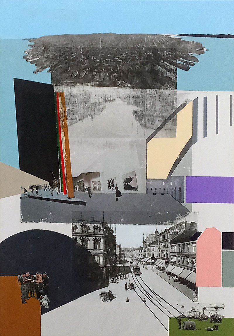
Soft Power, AKA Venice in the Middle
2025
Collage
50cm x 70cm
19 5/8" x 27 1/2"
Status & ownership
Currently in artist's studio, Berlin
Contribution
Venice in the Middle marks a formal departure within Bolter's practice — a transfer painting that uses the acrylic gel medium technique not as a resolved method but as a site of experiment. Where A Colorful History works typically anchor one historical photograph in clean painted fields, this work layers multiple transfers from different series, geographies, and decades, with paint assertive enough to partially override the image sources. The work extends the logic of the Kottbusser Tor painting — where a dominant colour block asserts itself over the photographic surface — into a more complex, multi-layered composition. It is also formally self-referential: a Rietveld-era transfer painting becomes source material for a 2025 transfer painting, making Bolter's own practice the primary art-historical reference. The result is less a resolved transfer painting than a demonstration of the method under pressure — and a document of the moment when Breaking Down Art's multi-transfer logic re-emerged from the rubble of a failed commission canvas.
About the work
Transfer painting built from a failed Oslo canvas — the exact size requested for a Berlin group show. Multiple acrylic transfers are layered: a faded Oslo cityscape, a Rietveld-era painting using 2007 Venice Biennale photographs, a 1906 San Francisco earthquake aerial, and leftover WWII source photographs — held together with assertive colour fields. Venice in the Middle began with a failure: a transfer of an Oslo street scene onto a 50×70cm canvas where the fine detail didn't come through. After sanding it smooth and trying again on the bottom with the same result, Bolter decided to experiment rather than abandon the canvas — it happened to be exactly the format requested for a group show at Freiluft Kunst Klub Berlin (FKKB) at Hotel Berlin. Working quickly and materially, Bolter gathered laser prints lying around the studio: transfers from past paintings and leftover WWII source photographs that hadn't made it into the war paintings series. These became the elements on the canvas, and the question became whether composition could be worked out through paint around them. The result is structured in horizontal bands. At the bottom, the Oslo street scene transfer — imperfect, detail-less. Behind and above it, a faded ghost of the same Oslo photograph from the first failed attempt. In the middle, a transfer of a Rietveld Akademie painting that itself used photographs taken at the 2007 Venice Biennale — a painting within a painting, process folding back on itself. At the top, a 1906 San Francisco aerial disaster photograph taken from a balloon camera, sourced from an earlier SF painting. In the corners, WWII documentary photographs — offcuts from the war paintings, the first moment Bolter returned to layering multiple transfers on a single canvas since art school. Around and between all of this: assertive colour fields — a large black circle, rust and red verticals, cream, salmon, and purple blocks — given more authority than in a typical A Colorful History transfer painting. The paint does not illustrate the photographs; it navigates around them and at times overrides them. The work spans more than a hundred years of image time: 1906 San Francisco, 2007 Venice, the WWII archive, the failed Oslo present. It is also a private archive — Bolter's own practice layered onto itself, his student work becoming art-historical material. The subtitle, arrived at in retrospect: A Painting in a Painting over 100 Years.
Intent
To use a failed transfer canvas as an opportunity to experiment — layering transfers from past paintings and pushing the painted color fields to dominate rather than support the photographic source material. The question was whether composition could be worked out through paint around a set of pre-existing image elements.
Making
Made quickly and experimentally after a failed Oslo transfer — the initial transfer didn't bring through the fine detail, so sanded it smooth and tried again on the bottom with the same result. Decided to experiment rather than abandon the canvas. Grabbed a bunch of laser prints that were lying around — transfers from past paintings and leftover WWII source photographs — and worked out the composition with paint around them. The process was material-led, not preconceived.
Where it went
Wasn't sure going in whether the paint dominating the image would work — but it did. Can see the thread back to Kottbusser Tor and how a large dominant color block can dictate the image. The result was a surprise in the right direction.
In the practice
Submitted to a group show at Freiluft Kunst Klub Berlin (FKKB) at Hotel Berlin, Berlin — an end-of-year group show with around 20 artists, each asked to make a 50×70cm painting. The canvas was already that size from the failed Oslo transfer, so the work went from experiment to submission. Was shown and well received.
What this isn't
Pushing away from the traditional ACH technique — one photograph, clean paint blocks. Wanted to experiment with multiple layered transfers and let the paint be more assertive and less controlled.
In the series
Grew out of a failed attempt at an Oslo transfer painting — part of an expansion of A Colorful History beyond San Francisco and Berlin into wealthier European cities (Oslo, Zurich) that might be more commercially viable. Neither the Oslo nor Zurich paintings were finished; the direction is now morphing toward the Mediums of Perception sub-series. The failed canvas became an opportunity to experiment with layering transfers from past paintings. The work connects back to the two Breaking Down Art paintings made at the Rietveld Akademie — the first time multiple photos were transferred to a single canvas.
The primary art-historical reference is Bolter's own earlier work — a transfer painting made at the Gerrit Rietveld Akademie, Amsterdam, itself a mixed transfer and acrylic painting using photographs from the 2007 Venice Biennale visit. That painting becomes both source material and historical layer in this work, making Bolter's own practice the art-historical frame. The logic connects to Richard Hamilton's collage approach — image layers coexisting without one explaining the other — and to the Kottbusser Tor painting within the Gates of Perception series, where a dominant painted color block asserts itself over the photographic source.
Visual Similarity
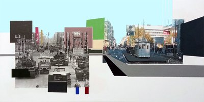
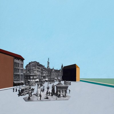
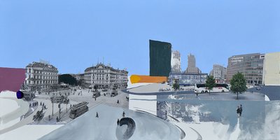
Works with similar visual structure, found by comparing image embeddings across the archive.
Art/Official sessions
Soft Power, AKA Venice in the Middle — Art/Official session, June 24, 2026
This is a copy of the session record, June 24, 2026. Canonical URL: /sessions/venice-in-the-middle-2026-06-24.
Transcript
- Artist
In a way this is a stand alone artwork, it uses the technique of the photo transfer from the colorful history series, but because for a new painting the transfer was not good, i decided to play around with it and add photo transfers from past paintings, so was a bit of an experiment
- Art/Official
Got it — so this one borrowed the transfer method but became something different in the making. The failed transfer became the opening to remix older work. Where were you when you made this one?
- Artist
I was at my studion in the CANK building in Berlin, was asked to make a painting for a group show at the FKKB gallery at the hotel-berlin
- Art/Official
Thanks — so a commission for FKKB at Hotel Berlin. That's a specific constraint and occasion. Before you upload — I'd like you to describe this work to me first, before either of us sees it. I will ask you again later, once we've talked it through, and we'll look at both together at the end. There's no right way to do this — however it comes is exactly right.
- Artist
not a commisision, just a submission. the painting has a few levels of perspective with a street scene on the bottom and a skylineview of san francisco on the top, in the middle is a transfer of a painting of mine from the venice bienalle and then there are some smaller war photos in the corners and then alot of abstarct color blocks
- Art/Official
Got that. Now go ahead and upload the image when you're ready.
- Artist
I have uploaded the primary artwork image.
- Art/Official
I can see the layering now — the SF skyline at the top with that distinctive bay geography, the Venice Biennale transfer in the middle (the gallery interior with those black and white photographs on the wall), the street scene below with the curved architectural elements, and then the color blocks — that deep black circle on the left, the rust and red verticals, the cream and purple and salmon fields on the right. The corners have those smaller documentary photographs. What's the title for this one?
- Artist
Venice in the Middle
- Art/Official
When did you make it?
- Artist
december 2025
- Art/Official
This is part of A Colorful History, yes?
- Artist
more part of the Breaking Down Art series
- Art/Official
Got it — Breaking Down Art, not ACH. That shifts things. What's the medium here — acrylic on canvas like the transfer paintings, or something different?
- Artist
acrylic transfers and acrylic on canvas
- Art/Official
What are the dimensions?
Expand full conversation
- Artist
50cm wide and 70cm high
- Art/Official
How should this read on the site grid — small, medium, large?
- Artist
medium
- Art/Official
The work layers San Francisco at the top, the Venice Biennale piece in the middle, and war photographs in the corners — but what was the actual failure that opened this up? What didn't work about the initial transfer?
- Artist
on the bottom part is a transfer from oslo norway, and then on the top under the san francisco image, there is a faded oslo image, the same photo, but the top one was the first failure, and I sandeded it smooth, then tried on the bottom and the transfer didn't work again. was not terrible, but the whole thing relies on some of the small destails between the paint, and they didn't come through, so decided to experiment with this one.
- Art/Official
So the transfer itself — the fine detail didn't punch through, and sanding it smooth meant you lost what you were trying to capture in the first place. That's what sent you toward layering and breaking things down instead. When you decided to add the transfers from your past paintings — the Venice piece, the war photos in the corners — were you thinking of them as salvage, or was there something about mixing timeframes that felt right for this moment?
- Artist
a little bit of both, but in a way I just grab a bunch of laser printers that I had around and was more thinking, if I put these all on the canvas, can I work out the composition with paint
- Art/Official
So it was material-led — you had these prints lying around, and the question became: what happens if I treat them all as elements on the canvas and paint around them to find the form? That's different from the transfer paintings where the photograph is the anchor. Here the transfers are more like... waypoints you're navigating through with color. What's the city where this was made — still Berlin?
- Artist
in Berlin at the CANK studio
- Art/Official
Now tags — looking at this, I'd call it mixed media / collage with experimental or process-led as the conceptual frame. Does that land, or would you frame it differently?
- Artist
yes, that sound pretty good
- Art/Official
The Venice Biennale transfer in the middle — that's a transfer of a photograph of your work installed at the Biennale, or something else? I want to make sure I have the source material right.
- Artist
so its a bit meta, this is a transfer of a painting I was making in artschool at the rietveld in amsterdam, and itself is a painting with photos transfered and acrylic paint
- Art/Official
So the middle layer is a transfer of a transfer painting — the process folding back on itself. And that work was made at the Rietveld. What was the connection to Venice — was it shown there, or is that the name you're using for it?
- Artist
no, not shown there, put all the photos are from the venice bienalle in 2007 when i went there on an art school field trip
- Art/Official
Got it — so the source photographs inside that middle painting were taken at the Venice Biennale in 2007. The Rietveld work itself used those as its material, and now that whole painting — process and all — is transferred into this one. That's a genuinely layered thing: your 2007 documentation of other people's art, made into a painting at art school, which is now transferred into a 2025 painting made from failed transfers. Time is doing a lot of work here. What's in the war photos in the corners — do you know which conflicts or images those are from?
- Artist
those are from WWII and are images that didn't make it into my wordl war II painting, there were left over, but the war paintings are the first time I started using multiple photos tranfered to canvas again like the two breaking down art paintings from art school
- Art/Official
So those corner images are material that didn't make the cut for the WWII painting — offcuts that found a home here. And the war paintings themselves were the moment you went back to multiple transfers on a single canvas, the way you'd worked at the Rietveld. That makes this painting almost an archive of methods — the failed Oslo transfer, the Rietveld-era painting, the WWII offcuts, the SF skyline. Everything layered by a kind of material logic rather than a preconceived plan. How did the composition resolve itself? Looking at it, the horizontal banding is quite strong — street at the bottom, Venice in the middle, SF at the top. Did that structure emerge from laying the prints out, or did you have that vertical hierarchy in mind from the start?
- Artist
the San Francisco photo on top is also from a painting I made when in san Francisco, its a photo of the city in 1906 after the earthquake taken from a camera that was in the air from an air baloon. just a side note, I've only done 2 paintings of san francisco from the eartquake, there are so many of the photos around the city that you see growing up, but somehow a morbid,
- Art/Official
That's a striking detail — that SF panorama at the top isn't just a city skyline, it's an aerial disaster photograph. A balloon camera looking down at the wreckage of 1906. And you grew up surrounded by those images but only made two paintings from them. The familiarity making it harder to approach, not easier. So the vertical stack is actually three cities across time — Oslo at the bottom and faded behind the SF, a Venice Biennale visit in 2007 in the middle, San Francisco 1906 at the top. Did the structure feel like it was about time, or was it more about finding a composition that worked with what you had in hand?
- Artist
was done and fast, so was just getting the photos transfered, but the results are interesting and the time of it all is interesting. i've never been to norway, but my grandmother was born there
- Art/Official
That's a thread worth pulling — Oslo twice on the canvas, a city you've never been to, but your grandmother was born there. Did that feel like anything while you were working, or did that connection only surface after?
- Artist
I thought about it, was just doing the olso painting in general as an expansion of the a colorful history to expand and make more cities than san francisco and berlin, so did zurich too, but didn't finished either, the idea is morphing to the mediums of perception series. was also mainly thinking of making paintings from cities in europe that have more money, I love making berlin paintings, but hard to sell
- Art/Official
The Oslo connection then is more practical than personal — though the grandmother detail is there in the background. Makes sense. The FKKB show at Hotel Berlin — did it get submitted, and did it go in?
- Artist
was a group show with about 20 other artist, was asked to make a painting 50x70, which everybody was, so thats why I had the 50x70 olso messup and just went to work on that one
- Art/Official
So the format was given — everyone making 50×70 — and the failed Oslo canvas happened to be exactly that size. The submission practically made itself from the wreckage. Did it get shown in the end?
- Artist
yes, was a nice group show for the end of the year
- Art/Official
Good. So it went out into the world despite — or because of — the failure that started it. What's the name of the gallery or the show, do you know?
- Artist
frieluft kunst klub berlin fkkb.de at the hotel berlin, berlin
- Art/Official
Looking at the color blocks — that big black circle on the left, the rust and red verticals, the cream and salmon fields on the right — they're quite assertive relative to the transfers underneath. Were you consciously pushing the paint to dominate, or were you following what the transfers needed?
- Artist
was an experimantal painting so wanted to push the paint
- Art/Official
So the paint was given more authority here than in a typical ACH transfer painting — closer to the Kottbusser Tor logic, where the painted surface starts to assert itself over the image.
- Art/Official
Looking at it now — did the paint end up doing what you wanted, or did it take over in a way you didn't expect?
- Artist
yes, I can see the thread from the kottbusser tor painting and how a large dominat color block can dictate the image, not sure if its what I expected, but worked out, which I wasn't sure about going into it
- Art/Official
The Rietveld painting in the middle — is that a work you'd consider a direct art-historical reference for this one, or more of a material presence? I'm thinking about how to frame the lineage here — Richard Hamilton's collage logic comes to mind, that coexistence of image layers without one explaining the other.
- Artist
yeah, in a wierd way my own painting is tha art historical context
- Art/Official
That's a genuinely interesting move — the archive of your own practice becoming the reference point rather than someone else's. What were you moving away from with this one — was there anything you consciously didn't want it to be?
- Artist
wanted to experiment and push away from the tarditional technique of the colorful history series with one photo and clean paint blocks
- Art/Official
You described it at the start as having levels of perspective — street at the bottom, Venice in the middle, SF skyline at the top, war photos in the corners, abstract color blocks. Now that we've talked through all of it — the failed transfer, the grandmother connection, your own Rietveld painting folded into it — does it still feel like that to you, or has something shifted in how you'd describe it?
- Artist
yea, not only the perspective, but there is a whole time travelling part to the image and also the inside reference of a painting in a painting. "A Painting in a Painting over 100 Years"
- Art/Official
That's a strong alternative title — "A Painting in a Painting over 100 Years." Does that feel like a subtitle, or are you thinking of it as the actual title instead of "Venice in the Middle"?
- Artist
should be a title, but in a show now with the other title, I should have come here first, so lets make it a subtitle
- Art/Official
Next time come here first. Where does the painting live now — did it come back from the show, or is it still at Hotel Berlin?
- Artist
its at the studio and will be in a show next month
- Art/Official
Good — still in circulation.
- Art/Official
Is it available for sale, or are you keeping this one given it's heading into another show?
- Artist
not for sale until after the show
- Art/Official
Got it.
- Art/Official
I think we have everything we need. Let me put together the confirmation draft now.
- Art/Official
All staged. Open **Wrap up / confirm** in the sidebar — you'll find the descriptions, keywords, and formal assessment drafted there for you to review and edit before committing. The title, subtitle, dimensions, series, tags, provenance, and all the reflective fields are staged and ready. One thing to update after the next show opens: flip the availability status back to available.
- Artist
descriptionShort: This value must be shorter than the max length of 400 characters.
- Art/Official
Here's a shorter version: *Transfer painting built from a failed Oslo canvas — the exact size requested for a Berlin group show. Multiple acrylic transfers are layered: a faded Oslo cityscape, a Rietveld-era painting using 2007 Venice Biennale photographs, a 1906 San Francisco earthquake aerial, and leftover WWII source photographs — held together with assertive colour fields.* That's 340 characters. Want me to re-stage it?
- Artist
yes
- Art/Official
Re-staged. Should be good now — go ahead and commit from the **Wrap up / confirm** panel.
Also mentioned in
Vision Analysis
The composition is a tall vertical field organized as a stacked, interleaved sequence of photographic fragments and flat geometric planes of color. A band of clear sky blue caps the image, beneath which a black-and-white aerial photograph of a dense waterborne city spreads with ragged, brushed edges, as though the image were dragged or scraped into place rather than cleanly framed. Below it, a second grayscale photograph — a broad flooded thoroughfare reflecting building facades — dissolves downward into a pale gray wash. The middle register is held by a horizontal gray band containing tiny photographic figures: a gallery interior with framed pictures on walls and small visitors standing among them, rendered at a scale that makes the surrounding color planes feel architectural. The lower third is anchored by a large black-and-white street scene of an early-industrial city — tram tracks curving through the roadway, a streetcar, pedestrians in period dress, ornate multi-story facades with awnings and painted hotel signage. The palette splits into two registers that never fully merge: the photographic material stays in silvery grayscale, while the painted geometry carries flat, unmodulated color — sky blue, warm cream, muted lavender, salmon pink, olive green, burnt orange, deep navy, and a narrow vertical stripe of red, green, and ochre running like a seam down the left-center. The flat shapes behave like architecture of their own: a black trapezoid leaning into the composition at left, a dark arched form suggesting a dome at lower left, a pink silhouette at right that reads as a building profile. Tonal weight sits low and left, with the darkest masses gathered there, while the upper right stays light and open. Several distinct moments coexist in the frame without hierarchy or resolution. The street scene at bottom belongs to the era of trams and horse carts. The aerial city view and the flooded avenue read as mid-twentieth-century documentary photography. Two small color photographs interrupt the grayscale: a cluster of soldiers in fatigues huddled at the lower left edge, and, in the bottom right corner over an olive ground, helicopters hovering above figures in a field — imagery with the color cast of 1960s war reportage. The gallery visitors in the middle band appear contemporary. These periods are not blended; each retains its own photographic grain, tonality, and edge quality, laid adjacent or overlapping so the eye moves between decades within a few centimeters. Technically, the surface shows the marks of transfer or screen-based processes: the photographs have scraped, incomplete edges, drag lines, and areas where the emulsion or ink appears thinned to translucency, letting underlying color ghost through. The painted areas are hard-edged and matte by contrast, with clean seams where color meets photograph. Faint vertical streaking runs through the flooded-street passage, ambiguous between deliberate mark and process residue. What resists confident description is the spatial logic of the middle band: the gray plane the gallery figures stand on reads simultaneously as a floor, a rooftop, and a horizontal slab floating in front of the flooded scene, and the image offers no cue to settle which. Similarly, the vertical tricolor stripe functions as both a painted abstraction and something flag-like or mast-like, and its role in the pictorial space stays open.
View all analyses →