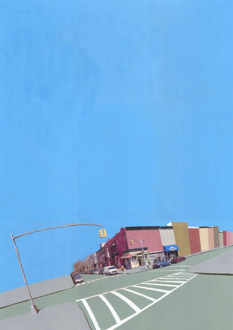
South Elliott and Lafayette
2004
Transfer painting
20" x 28"
50.8cm x 71.1cm
Status & ownership
Private collection
If you own this work, get in touch. I'll add you to the record and officially connect you to its history.
Contribution
South Elliott and Lafayette is an early and foundational example of the transfer painting logic that runs through Bolter's entire subsequent practice. Working with his own street photography rather than historical sources, it establishes the core formal relationship — flat painted colour fields cohabiting with a transferred photograph on a single canvas surface — that the A Colorful History series would refine and expand over the following two decades. The large painted sky as a structural device, pressing open space against photographic detail, is a formal decision consistent across the Brooklyn works and anticipates the later series' interest in the tension between paint and image. The work also carries the original conceptual ambiguity of the series title: the photograph may fade, the neighbourhood has changed, and the painting holds both possibilities in suspension.
About the work
Transfer painting of South Elliott and Lafayette Streets, Fort Greene, Brooklyn, fall 2004. Personal photograph on canvas via t-shirt transfer paper, with flat acrylic colour fields — painted sky above, buildings right, light post left. The corner's bulletproof bodega is long gone. A painting with a photo on it that doesn't exist anymore. South Elliott and Lafayette is one of a group of transfer paintings made in Fort Greene, Brooklyn in 2004, painted in Bolter's house around the corner from where the photograph was taken. The source image is his own — a personal street photograph of the intersection immediately outside his home, transferred to canvas using the t-shirt transfer paper technique that preceded the acrylic gel medium method he would develop for A Colorful History. The composition moves laterally rather than down a central axis: a crosswalk in the foreground, buildings painted to the right, a large light post to the left, and a flat painted sky holding the upper portion of the canvas. The sky — a recurring formal choice across the Brooklyn works — creates open space that presses against the photographic detail below, giving the image its gravity. On the corner was a bodega the neighbourhood called "bulletproof," named for the old-school protection setup requiring customers to pass money through a spinning transaction window. It no longer exists. The painting is, in Bolter's words, a painting with a photo on it that doesn't exist anymore. The Vanishing Landscape series title came from a Dutch art school assignment — students were given twenty minutes of perspective instruction and then told to draw without thinking about it, the exercise called "vanishing landscapes" in translation. Bolter found the assignment faintly absurd but kept the name, attaching it to a different idea: that the t-shirt transfer photograph might eventually fade, leaving only the paint behind. Years later a third meaning has arrived: the neighbourhoods themselves have changed beyond recognition. These works were made coming off the Art Collision tours, moving away from surrealism and large-format printing, and back to canvas and the immediate surroundings. The technique was rawer than what followed, but the logic — photograph and paint cohabiting on a single surface, addressed to an open future — runs directly through to the current practice.
Intent
The large sky was a recurring theme across the Brooklyn mini-series. The sky gives gravity to the image and creates space that plays against the detail of the photograph below.
Direct inspiration
The corner right next to Bolter's house in Fort Greene. On the corner was a bodega nicknamed "bulletproof" for its old-school protection setup — a spinning transaction window. The bodega is now gone.
Making
The t-shirt transfer paper method meant the photograph could eventually fade, leaving only the paint. Bolter found this possibility interesting rather than concerning — curious what that would look like — though none of the early works have been kept in direct sunlight long enough to test it. The latent future of the image was part of the point.
Context of making
A painting with a photo on it that doesn't exist anymore.
Where it went
The paintings landed well overall. The transfer technique was more raw and less refined than later work, but Bolter sees these Fort Greene pieces as foundational — they set the course for everything that followed through to the present practice.
In the practice
Made in Fort Greene, Brooklyn in fall 2004, painted in Bolter's house around the corner from where the photograph was taken. Part of a mini-series of transfer paintings made in his immediate neighbourhood after the Art Collision tours, working with personal photographs rather than historical ones.
Process
Made using the t-shirt transfer paper technique — personal photograph transferred to canvas, then painted with acrylic. Predates the acrylic gel medium transfer method used in the A Colorful History series.
What this isn't
Moving away from the surrealism of the Art Collision series, and from large-format printing. Without access to the large printer, returning to canvas felt natural — and with it, a desire to work in a more grounded, documentary register rather than the surreal collage logic of the earlier work.
In the series
The series name came from a Dutch art school assignment — students were taught perspective for 20 minutes and then told to draw without thinking about it. The assignment was called "vanishing landscapes" in translation (verdwijnend landschap or similar). Bolter found the assignment slightly absurd but liked the name. When he began transferring his own photographs to canvas, the name fit differently: the photograph might eventually fade, leaving only the paint — that would be the vanishing landscape. Years later a third meaning has arrived, as the neighbourhoods depicted have themselves changed or disappeared. The Fort Greene works were made in his own neighbourhood, not from a programmatic documentary impulse but from proximity and wanting to work with what was around him — though he was aware the area was changing.
Made coming off the Art Collision tours, so working with those artists was an active influence. Otherwise Bolter was visiting museums in New York but describes the Fort Greene works as more focused on the neighbourhood than on art-historical positioning. Hopper or Hockney may have been in the background — the interest in urban light and the street as subject — but less intentional than influences in later series.
Visual Similarity
Works with similar visual structure, found by comparing image embeddings across the archive.
Art/Official sessions
South Elliott and Lafayette — Art/Official session, June 1, 2026
This is a copy of the session record, June 1, 2026. Canonical URL: /sessions/south-elliott-and-lafayette-2026-06-01.
Transcript
- Artist
this is a fairly older work, part of the vanishing landscape series, which predated the colorful history. I was living in fort greene brooklyn and started making these paintings after the art collision series. this one is from the corner near my house at south elliott and lafayette streets
- Art/Official
Good timing on this one — Fort Greene feels like the origin point for a lot of what came later.
- Art/Official
Is this part of something ongoing, or does it feel more like a standalone moment within the Vanishing Landscape work?
- Artist
in a way its ongoing, it became the a colorful history series when I started using hisorical photos, but at this time was using my own photos that I would take
- Art/Official
That lineage makes sense — same transfer logic, different source material, and the shift to historical photos eventually gave it a broader frame. Where were you when you made this one?
- Artist
I painted it in my house around the corner from where the picture was taken
- Art/Official
Nice — made and shot within a few blocks of each other. Before you upload — describe this work to me first, before either of us sees it. There's no right way to do this — however it comes is exactly right.
- Artist
the photo painting shows the corner of south elliot and lafayette streets in brooklyn NY, you see a lot of white crosswalk in the bottom leading up to the intersection and then an extended yellow bus on the left and an extended building on thr right, all with a very large blue sky above
- Art/Official
That sky sounds like it does a lot of work in the composition. Go ahead and upload whenever you're ready.
- Artist
I have uploaded the primary artwork image.
- Art/Official
Found a legacy record — "Fulton and Lafayette," 2004, Brooklyn. The legacy has it at 20 × 28 cm, acrylic transfer and acrylic paint on canvas. A couple of things to confirm: The intersection name on the old site was "Fulton and Lafayette" rather than "South Elliott and Lafayette" — is Fulton the right street, or is South Elliott more accurate for the actual corner? And do those dimensions (20 × 28 cm) sound right to you?
- Artist
sorry this is another one and is south elliot and lafayette and its 20" x 28"
- Art/Official
No problem — so this is a separate work from the Fulton and Lafayette one. South Elliott and Lafayette, 20 × 28 inches. What's the title for this one?
- Artist
south elliot and lafayette
- Art/Official
And the year — roughly when did you make it?
- Artist
2004 in the fall
Expand full conversation
- Art/Official
All staged. At 20 × 28 inches that's a solid mid-size — the rule of thumb would put it at **md**, but how do you want it to sit on the site grid?
- Artist
yes md
- Art/Official
Good. You mentioned you shot this corner yourself and transferred it — this was the t-shirt transfer paper method, before the gel medium?
- Artist
yes this was the t-shirt transfer technique
- Art/Official
You described a big sky dominating the top of the composition. What made you want so much sky in this one — was that what the corner actually looked like, or was it a choice you pushed in the photograph?
- Artist
I'm not really sure, but was a theme in mini series from brooklyn, I think I liked they way in gives gravity to the image and creates the space against the detail of the photograph
- Art/Official
That tension between the open painted sky and the photographic detail below — was the sky painted as a flat colour field, or did you work into it?
- Artist
pretty much flat, one color, maybe some prush strokes, so not super smooth, but painted one color
- Art/Official
So the sky is doing exactly what a colour field does — holding space rather than describing it, which makes the photograph below read harder by contrast. Was the yellow bus something you sought out, or just what was there when you took the shot?
- Artist
this one doesnt have the yellow bus, I thought I was uploading a different one. but was just trying to figure out how to actually fill the composition, in this one there are buildings that I painted to the right and then a big light post on the left
- Art/Official
Ha — so your blind description was of a different painting entirely. Let me update what we're actually looking at. What does the sky look like in this one — still a large painted field above the photograph?
- Artist
yes, and what I just wrote, and there is a painted crosswalk, but the perspective goes from left to right more than down the middle
- Art/Official
Got it — a more lateral composition, the crosswalk anchoring the foreground, buildings painted to the right, light post to the left, sky above. The perspective pulls across rather than drawing you straight in. Was this corner particularly meaningful to you at the time, or was it more about what it offered compositionally?
- Artist
yeah, was the corner right next to my house, and on the corner was a bodega we called bullet proof because it had the old school protection where you had to put the moeny in a spinning thing and get what you wanted back. its gone now
- Art/Official
That's a great detail — the bulletproof bodega as neighbourhood landmark, now gone. That's exactly the kind of thing the Vanishing Landscape series was built to hold.
- Art/Official
Was there anything specific about what Fort Greene felt like in 2004 that made you want to document it — some sense that it was already changing, or was that awareness something that came later?
- Artist
you could tell it was changing, nit sure if that was my motivation to show that, but just wanted to work with my neighborhood. i did call it the vanishing landscapes, because I got an assigbment in the art school in holland they called making vanishing landscapes, then they taught use about perspective for 20 minutes and then told us to make drawings not thinking about perspective. I thought it was a bit ridiculous, but liked the name, the name was just the translation from dutch, vervelent landscaap, or something close to that, so I don't really know the context of hose words to dutch people. but working with the prints on canvas I thought of the name and was thinking more about how the photo might fade eventually and that would be the vanishing landscape. but now that years have pass it has this other meaning too
- Art/Official
That's a really rich origin — the name arriving from a mistranslation of a Dutch art school exercise, then finding its own meaning through the material, and then a third meaning arriving years later without you planning it.
- Art/Official
You said the photo *might* eventually fade — has it, on any of the early ones? And did that possibility feel like a risk or part of the point?
- Artist
I don't think it has, but still, could. maybe that was part of the point, i would kind of wonder what that would look like, which I thought would be cool. but don't know how long that would take, I don't think any of them have been keep in direct sunlight for long periods
- Art/Official
So it's less a threat and more an open question — you made something that has a possible future you can't fully predict, and that uncertainty was interesting rather than worrying.
- Art/Official
When you were making these in Fort Greene — who else was in the conversation for you? Were there artists you were thinking about or looking at at the time?
- Artist
was coming off the art collision tours so working with those artists was inpiring. otherwise, I would go to museums in new york, but think I was really just focused on the neighborhood at that moment, could be a hopper or a david hockney I came across, but was not as intentional as other works got influenced
- Art/Official
The Art Collision series came just before this — what felt different about moving from that work into the Vanishing Landscapes? Was there something you were moving away from?
- Artist
I didn't have access to the large printer anymore, and wanted to make canvases again. and also not be so surreal
- Art/Official
That makes sense — the transfer paintings are grounded in a very specific place and moment, which is almost the opposite of surrealism. Where does this one live now — still with you, or did it sell?
- Artist
it is still in brooklyn, I think at Ian Quiles home
- Art/Official
Got it — so it's in a private collection in Brooklyn.
- Art/Official
And the availability — is it sold, or still technically yours and just with Ian?
- Artist
it wasn't sold and we havnt' talked about it, but I think of it as his
- Art/Official
You described it at the start as a different painting entirely — the yellow bus, the crosswalk going straight down the middle. Now that we've talked through this one, how does it actually feel to you looking at it?
- Artist
its a painting with a photo on it that doesn't exist anymore
- Art/Official
That's a good line. The bulletproof bodega, that version of the corner, that Fort Greene — it's all in the transfer now.
- Art/Official
Looking at it now — did the painting land the way you wanted, or did it end up somewhere different from what you were going for?
- Artist
I think they landed well, I've imporoved the transfer technique and the extended painting was a bit more raw and not refined, but these works definitly set me on a course that I'm on to til today
- Art/Official
That continuity is clear — the logic of the t-shirt transfers directly became the gel medium transfers, which became A Colorful History, which became Mediums of Perception. The raw edges of these early ones were the starting point for all of it.
- Art/Official
I have everything I need. Let me put together the confirmation draft.
- Art/Official
All done. Open **Wrap up / confirm** in the sidebar — you'll find the staged fields and those draft texts waiting for you. Edit anything that doesn't sound right, then press **Commit** to write it to the record.
- Artist
don't forget the tags
- Art/Official
Good catch. Let me stage those now.
- Art/Official
All staged. These are inferred so worth a quick look in the **Wrap up / confirm** panel before you commit — adjust anything that feels off. Then you're good to go.
- Artist
descriptionShort: This value must be shorter than the max length of 400 characters.
- Art/Official
Let me fix that — the short description needs to come in under 400 characters.
- Art/Official
Updated — that one comes in well under 400 characters. Check the **Wrap up / confirm** panel again and it should be good to commit.
Also mentioned in
Vision Analysis
The composition is a tall vertical field ruled by emptiness: a flat, nearly unmodulated sky blue occupies roughly the upper three-quarters of the canvas, pressing all pictorial incident into a narrow band along the bottom. Within that band, a photographic fragment of a street corner sits low and slightly left of center — a row of flat-roofed brick buildings meeting at an intersection, a corner storefront with awnings and signage, parked cars, bare street trees, and a few small pedestrian figures — while everything around the photograph is painted: the wide foreground of asphalt-green roadway with white crosswalk stripes fanning across it diagonally, grey sidewalk wedges at the left and lower right, and, extending rightward from the photographic buildings, a stepped procession of flat painted facades in muted salmon, olive-gold, brick red, and tan that continue the block as pure color planes without windows or detail. A single painted streetlamp arcs in from the left edge, its long curved arm reaching over the road toward a photographic traffic signal, the two meeting near the image's structural hinge. The palette is restrained and sun-bleached: one dominant blue, a sage-green road surface, warm dusty facade tones, and the small concentrated flecks of color inside the photograph — a red storefront sign, a blue awning, the yellow of traffic lights, a pedestrian's pale jacket. The whites of the crosswalk are the sharpest values in the image, their hard diagonals carrying more graphic force than anything in the buildings. Light within the photographic fragment falls low and raking, consistent with early morning or late afternoon; the painted zones carry no cast light at all except the lamp's thin shadow, so the image holds two lighting regimes — one atmospheric and specific, one abstract and timeless. The coexistence of states here is between the photographic and the painted continuations of the same place. The photograph supplies one corner of reality — datable by its cars, signage, and street furniture to the recent past — and the painting extends that reality in both directions: the block continues rightward as color memory, stripped of particulars, and the street continues toward the viewer as simplified plane and stripe. The seam is deliberately legible; edges where photograph meets paint are soft but findable, and the painted facades match the photographic rooflines' angle while refusing their detail, as if the place were mid-dissolve — either materializing from color into fact or fading from fact into color. Technically, the surface shows thin, even paint in the sky with faint vertical streaking and subtle cloudlike breathing in its tone, flatter opaque handling in the road and facades, and the compressed grain and slight blur of a transferred or printed photograph in the central fragment. The crosswalk stripes are painted by hand — their edges waver slightly — and the streetlamp is rendered with just enough modeling to cast doubt on whether it belongs to the photograph or the paint. What resists confident description is the direction of the dissolve: whether the painted zones are the photograph's past (the place before detail arrived), its future (the place after memory has simplified it), or simply its abstraction. The vast empty sky refuses to weight the question — it belongs equally to both regimes — and the lone arcing lamp, half in each world, is the only element that commits to neither.
View all analyses →