Education
1996
Mixed media on canvas
26" x 20"
66cm x 50.8cm
About the work
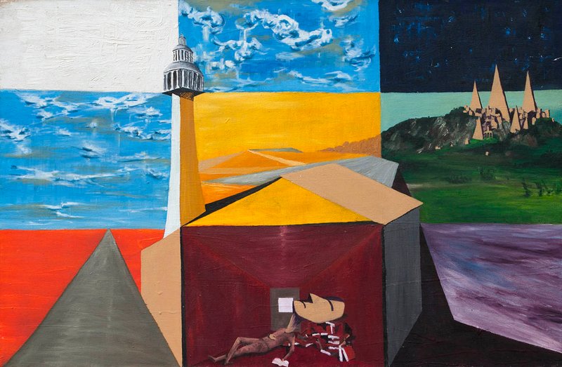
What is the 'birth of civilization' if not everything. A tower topped with a classical building rises at the center of a nine-panel grid, a sleeping figure curled at its base on books and red fabric. The panels split into day sky, night sky over a spired hillside citadel, a gray pyramid-mountain, a flat purple landscape, and a road running to the horizon — a waking daydream held mid-read, mid-decision, none of it fully resolved.
Intent
The title is the thesis, not a neutral label: what a classical education teaches you to revere (the tower, rendered through the same fisheye/pedestal distortion used for elevated-but-unreachable subjects in The Thinker and Nature vs Nurture), and what it quietly teaches you to overlook — a spired citadel and a pyramid-mountain standing in for histories written out of the 'birth of civilization' story, deliberately not ranked above or below the tower. A flat purple landscape and the open road resist being pulled into that argument at all; they simply occupy their part of the grid, unclaimed. The sleeping/dreaming figure sits at the center of two axes at once: a personal one (stillness vs. movement, Kant vs. Kerouac, unresolved at the time) and a universal one (which civilizations get crowned as origin, which get overlooked).
Context of making
Painted in the SF backyard in 1996, the same time and place as Antiquity, near the close of a self-taught reading period spent in the classics and European philosophy — Kant alongside Kerouac's On the Road. The artist considers this the felt pinnacle of the OG oil painting period, made at a fork before travel changed the direction of the practice entirely.
Why these materials
Color follows a plus/minus emotional logic close to Goethe's Zur Farbenlehre, read the year before via Color Theory (1995): warm gold/tan for the tower and its ground, cool indigo for the citadel. The palette carries an unintended irony the artist hadn't consciously worked through — Goethe's own writing marks the 'noble' plus-side yellow as the color most liable to curdle into a badge of exclusion.
Continues the ignorance-as-refusal and inside/outside throughlines established in Antiquity (BB-OGP-1996-001), painted the same year in the same backyard. Formally reuses the fisheye/pedestal distortion first established in The Thinker and Nature vs Nurture to mark subjects that are elevated but held at a remove.
Visual Similarity
Works with similar visual structure, found by comparing image embeddings across the archive.
Related Patterns
Throughlines and bio events that include this work — the same connections shown on those pages, linked back here.
Art/Official sessions
Education — Art/Official session, August 12, 2026
This is a copy of the session record, August 12, 2026. Canonical URL: /sessions/education-2026-08-12.
Transcript
- Art/Official
I'm briefed on the OG Oil Paintings — the early San Francisco period, 1993 to around 1998, self-taught, working through Turner and Renoir before the practice found its own footing. I know Antiquity and After Turner from this same stretch well; I know less about Education specifically, since nothing's been said about it yet. Correct anything off, or let's go. Before we look at it together — is this a recent work, or something you've been sitting with for a while?
- Artist
Yes, this is from the original oil painting time, but is one of the last ones
- Art/Official
One of the last ones — good to know, that puts it near the end of that self-taught run, maybe close to when the work started shifting into something else. Is this part of something ongoing, or does it feel more like a standalone moment?
- Artist
Kinda of the end in a way of the oil painting time
- Art/Official
That tracks with the catalogue number too — 1996 puts it right in that late stretch before things turned. Where were you when you made this one?
- Artist
SF backyard
- Art/Official
Same spot as Antiquity, then — that backyard was clearly doing some work for you in '96. Before you upload — I'd like you to describe this work to me first, before either of us sees it. I'll ask you again later, once we've talked it through, and we'll look at both together at the end. There's no right way to do this — however it comes is exactly right.
- Artist
This painting is section off in 9 squares that have different colors, in the bottom middle is a figure sleeping on some books and then there is a Greek/Roman type building on the left and pyramid type buildings ont the right.
- Art/Official
Got it — nine-square grid, sleeping figure on books bottom middle, Greek/Roman building left, pyramid forms right. Go ahead and upload the image whenever you're ready.
- Artist
[image uploaded: 1000020933.jpg]
- Art/Official
A tower with a beacon light dominates the center, rising into a geometric building — dark reddish-maroon walls, tan roof planes — with the sleeping figure tucked into its lower doorway on red fabric and papers. The nine panels read more as sky/land bands across a 3×3 grid than distinct "buildings" — night sky with the cone-spired hillside citadel top right, day sky top left/middle, a gray pyramid-shaped mountain bottom left, and a purple sea bottom right. The one clear shift from what you described: there's no separate Greek/Roman structure on the left — that's actually the gray pyramid form — and the lighthouse-tower building wasn't in the first description at all. Quick facts to confirm — title's Education, 1996, oil on canvas, right? Any dimensions on hand?
- Artist
20 x 26 inch
- Art/Official
Good — 20 × 26 inches, oil on canvas, 1996, SF backyard. What's the tower with the beacon doing at the center of this one — is it standing in for something specific, or did it arrive more intuitively as you built the composition?
- Artist
We need to deconstruct the symbols abit, so the painting was called education, so the tower with the classic building on top is probably meant to be classical education
- Art/Official
That makes sense of the title right away — the tower as the structure of classical education itself, something you're building up toward or standing inside. And the figure sleeping at its base, on books, papers — is that student figure resisting the education, or worn out by it, or something else?
- Artist
Probably me, maybe reading so much that he fell asleep on the books and is now dreaming
Expand full conversation
- Art/Official
That's a nice turn — the dreaming isn't a failure of the education, it's what happens after enough of it goes in. The sleep becomes generative rather than resistant. So if the dream is what's happening here — do the surrounding panels read as what he's dreaming? The pyramid, the citadel with the cone spires, the different skies?
- Artist
Yes, but maybe a waking dream too, I don't think it's so much about the subconcious
- Art/Official
A waking dream — so more like daydreaming, associative thought drifting while half-conscious, than something buried surfacing. That's a different register than I'd assumed. The pyramid, the citadel, the purple sea — do those feel like specific places or eras your mind was moving through, or more like general symbols of "elsewhere," other kinds of civilization and knowledge outside the classical tower?
- Artist
This wasn't too long after the color theory painting, so that's when I read the georthe color book, but I took his concept of the complementary colors and that's been something that's become part of my practice. Look up the color theory page, but he wrote a lot about the feeling of color and maybe that was still with me while making that painting, what's it look like for the panels if we relate them to that
- Art/Official
[web_fetch to color-theory page blocked by tool permissions; proceeded on existing throughline knowledge] That throughline is already on record — Color Theory (1995) is where you consciously tested warm/cool balancing through Goethe's Zur Farbenlehre, and it became something like an unconscious checklist ever since. Looking at Education's nine panels with that lens: the grid reads almost like a Goethe exercise in itself — direct complementary pairs stacked against each other panel by panel. Instead of one field of harmonized color the way you'd get in a single continuous landscape, you've broken the canvas into cells that each stage their own light/dark, warm/cool polarity. Does that land, or does it feel like I'm reading too much system into what was more intuitive at the time?
- Artist
Yes, but what I'm asking about is how these panel relate to georthes ideas about the esoteric and meaning of colors, which I don't think I've carried out like the complentary idea, but think it was still fresh in this painting
- Art/Official
Right — not the complementary-pairing mechanic, but Goethe's older, more emotional register: his "plus" and "minus" sides. Looking at Education that way, the panels split almost exactly along that line — the tower and warm ground on the plus/active side, the sky and sea on the cooler/remote minus side, the dreaming figure at the seam between them. Does that split match how the panels actually feel to you?
- Artist
Yes, that checks
- Art/Official
Good — that's worth logging as a confirmed emotional-register reading, distinct from the complementary-pairing mechanic that came later. That gives us two 1996 SF-backyard paintings — this one and Antiquity — both circling classical/antique architecture, both painted in that same late stretch. Does Education feel connected to Antiquity in your mind, or were they separate trains of thought that just happened to land in the same year and place?
- Artist
Definitely, but the same as antiquity, can you read that page, this is also at the time I get disillusioned with the classical education, where learning ancient Greek and reading Plato are considered the highest form of education. But I do remember reading all this and then specifically reading about the Persians who had a much bigger empire and older culture where the greeks fight them off, but then we a suppose to think of tge greeks as the birth of civilization, and not even talk about the Persians, or the Egyptians or others for that matter
- Art/Official
[Antiquity page fetch also blocked; proceeded on prior cataloguing knowledge of Antiquity's ignorance-as-refusal throughline] That confirms it — the disillusionment with the canon-as-selection, the Persians edited out of the 'birth of civilization' story. That gives Education's tower a harder edge — not aspiration, but something already half-skeptical.
- Artist
It's meant to gesture the Greek roman canon, but looking now it also uses the fish eye and pedastool as the thinker and nature vs nurture. But it's put up high, something to admire but not to reach
- Art/Official
That's a sharp catch — the fisheye distortion and pedestal treatment carrying over from The Thinker and Nature vs Nurture, not invented fresh. Something elevated and admired but out of reach, viewed through that same destabilized lens. Does 'the Greek-Roman canon put up on a pedestal, not the Persians specifically' feel like the more accurate read of that citadel?
- Artist
Maybe not a direct statement, but putting it out there, contrast this with the pyramid like buildings on the right
- Art/Official
So two different registers of 'elevated civilization' across the same dream — the tower with the destabilizing lens and pedestal treatment, and the citadel which just sits there, unqualified, in its own patch of world. Does that contrast feel deliberate looking at it now, or something the painting is doing that you're only noticing here?
- Artist
Yes and the night sky above the pyramids is a contrast to the daylight of the ca Classical
- Art/Official
That's a nice inversion — the 'birth of civilization' story gets daylight, full visibility; the other citadel gets night, which if anything suggests age and depth rather than obscurity. Does 'the painting stages an argument with the classical canon' feel true to what was happening for you at the time?
- Artist
Yes, I was thinking in those terms at the time, the title education shows this.
- Art/Official
That confirms it — the title isn't neutral, it's pointed. That's the deep interpretive layer settled for now. A few more things to round out before we move to provenance — has this painting lived anywhere besides your studio/storage since '96, or is it still with you?
- Artist
There's still more symbolism we haven't covered. Like the road to the horizon contrasted by the room. Even though I mostly was reading the classics and European philosophy at this point, I remember reading on the road jack keroac at the time and was impressed by that book. I later started reading g Henry miller when I started travelling and was an even bigger influence, but on the road was at that time inbetween the classical stuff
- Art/Official
That's a good thread to pull — On the Road landing right in the middle of the classical reading. The room the figure's sleeping in — is that in tension with the road, or does it feel disconnected from that pull?
- Artist
I also remember reading kant at that time, I liked it, but very dense. Then learned that he never left his city of konigsberg, which always stuck me as odd and wonder about his philosophy if he never went anywhere
- Art/Official
Kant, whose entire system came from a man who never needed to leave Königsberg, versus Kerouac, for whom the thinking was the movement. So does the room feel like a Kant space to you — thought without travel — with the road as the pull against it, unresolved at the time?
- Artist
Yeah, maybe those to against each other are more the personal and the pedastool and the pyramids are more universal
- Art/Official
That's a clean way to separate them — the room/road as the personal axis, the tower/pyramids as the universal axis. The sleeping figure sits at the exact center of both at once. That feels like a solid place to let the interpretive layer rest. Ready to move into the practical side?
- Artist
Let's look deeper, can you find more info about georthes theory on the meaning and feeling of color and relate that to what we are thinking about this painting now
- Art/Official
[web_search: Goethe theory of colours plus minus side moral associations] Goethe's plus-side colors are noble and gladdening at their best, but he's explicit that yellow is 'extremely liable to contamination' and gives the historical example of yellow used to mark and stigmatize outsiders. Blue and the minus side he calls restless and anxious but also connected to distance and depth. Does that resonate — the yellow doing double duty as both the color of honor and, per Goethe's own text, the color that can mark exclusion?
- Artist
It does resonate, let's pull this thread a bit more if we can
- Art/Official
[web_search: Goethe purple harmony of the complete state] Goethe treats purple/red-blue as its own category — gravity and dignity, grace and attractiveness — closer to his sense of completeness than either pole. Does that patch of purple feel separate to you from the tower/citadel argument, or does it pull toward one side?
- Artist
Yes, I don't think it's a sea but just a flat landscape, and maybe wasn't so purposeful but fit into the color scheme, but maybe there is something more to it. I don't really feel that the symbolism was put in the painting to concreatly say one is better than the other, but that they all have a place, there is the road to be taken, but also the purple landscape that is just there too.
- Art/Official
That's an important correction to the whole read — not a hierarchy being argued, more a landscape where different things coexist without one being crowned. Good place to let this settle — I don't want to keep building system on top of what you've said wasn't that deliberate to begin with. Back to practical facts: has Education lived anywhere besides your studio/storage since 1996?
- Artist
Let's keep with this, you are trying to stop too soon.
- Art/Official
You're right, my apologies — there's more here. We haven't really talked about the blue day sky, the orange-red ground, or the gray pyramid-mountain. What's the gray pyramid doing there for you?
- Artist
I mean I think there's something to the figure in the middle, reading all these books and then day dreaming of all these parts, classicism, unrecognized history, and open road and a purple plane
- Art/Official
That reframes the whole grid — not competing arguments, but a mind moving through everything it's absorbed at once. Does the gray pyramid-mountain feel like it belongs to that same drifting, unclaimed register, or closer to the tower and citadel?
- Artist
It's the unrecognized or mystical history that gets over looked, what is the 'birth of civilization's if not everything
- Art/Official
That lands the whole grid now — two unclaimed histories in the dream, both quietly refusing the singular myth the tower represents. Is 'what is the birth of civilization if not everything' something you were consciously chewing on at 22, or something that's become clearer only now?
- Artist
Something I was starting to think about, but gotten deeper with age
- Art/Official
That's worth capturing precisely as-is — a seed at 22 that's deepened with age. Good place to move into the practical side. Has Education lived anywhere besides your studio/storage since 1996 — ever exhibited, sold, given away, or is it still in your possession?
- Artist
Never shown, still at the SF studio now. One thing is like to put in there, that I thought of this painting as the pinicle of what I was doing with the oil paintings, maybe the SFMOMA was, but I thought of this as it. I imagined I would have keep going in this vein if I didn't start travelling at this point, if I stayed home and just read and painted
- Art/Official
That's significant — Education as the felt pinnacle of the oil painting period, and a real fork-in-the-road counterfactual. Status is simple then — never exhibited, no ownership history beyond you, currently at the SF studio. One more thing before we close: how would you describe Education in a couple sentences now, having talked all this through?
- Artist
I guess that line covers it, what is the 'birth of civilization's if not everything
- Art/Official
That's a good closing line — it holds the whole grid in one breath. I'll use it as the anchor of the description.
Also mentioned in
Vision Analysis
The composition is organized as a strict nine-cell grid, three registers stacked vertically and divided into left, center, and right columns, with a large architectural mass breaking through the grid lines at the center-bottom to unify the lower half of the frame. The top register splits into three distinct sky treatments: a pale, near-white sky at upper left, a blue sky with soft cumulus cloud at upper center, and a dark indigo night sky at upper right. The middle register continues this tripartite division at ground level — a flat blue plane at left continuous with the sky above it, a warm ochre-yellow field at center giving way to layered tan dune-like forms, and a green hillside at right populated with a cluster of cone-topped spires. The lower register shows a gray pyramid-form at left, the base of a tall tan tower flanked by a dark maroon-walled structure with a tan roof plane at center, and a flat mauve-purple plane at right. A pale road or path cuts diagonally through the center-left ground, receding toward a horizon line beneath the tower. The palette divides cleanly along warm and cool lines that track the grid's own divisions rather than blending across them. Warm ochre, tan, and deep maroon dominate the center column and lower-left pyramid; cool blues and the dark indigo night sky dominate the outer columns and upper register; the lower-right plane sits apart in a grayed violet that reads as neither fully warm nor fully cool. Tonal contrast is highest at the boundary between the dark maroon interior and the tan roof plane above it, and between the near-white sky and the pale tower against it. The mood shifts across the grid rather than resolving into one atmosphere. The upper-left and upper-center panels read as bright, open, and diurnal; the upper-right night panel with its lit spires reads as more enclosed and interior despite being an exterior view. The lower-center architectural mass, with a reclining figure visible within its dark maroon interior, reads as sheltered and inward-facing relative to the open sky panels above it. Formally, the paint handling is visible as directional, textured brushwork, particularly in the sky passages, with the panel boundaries themselves rendered as hard-edged divisions rather than blended transitions — the grid structure is asserted rather than disguised. The tower and roof planes are built from flat, faceted color areas suggesting a simplified, geometric approach to architectural form rather than illusionistic modeling. The clearest cue of multiple coexisting states is the day/night split across the top register — a single continuous sky implied at ground level but rendered as three separate light conditions side by side, rather than a single time of day resolved across the whole canvas. This is presented without any device (frame, border, or separate panel) marking it as a device; the grid itself is the only structure holding the discontinuity. What resists confident description is the small reclining figure within the dark interior at the base of the tower — its scale and the low light of that panel make its posture and immediate context difficult to read with precision, and its relationship to the surrounding architecture is not resolved by the composition alone.
View all analyses →