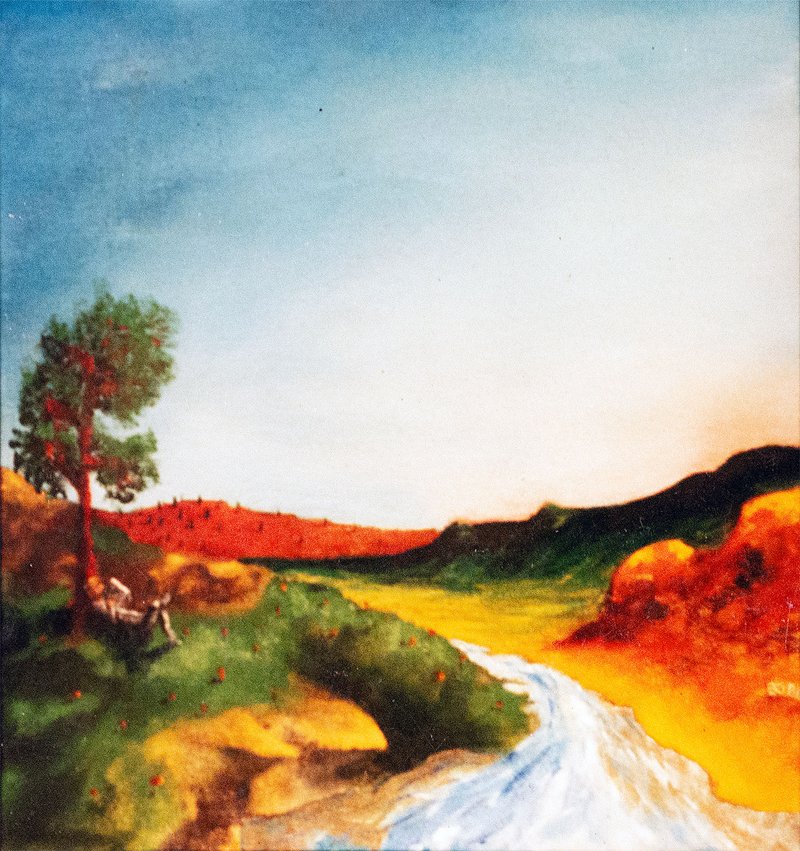
Color Theory
1995
Mixed media on canvas
16" x 20"
40.6cm x 50.8cm
Status & ownership
Whereabouts unknown
Provenance record
Painted in 1995 in the backyard of a San Francisco residence.
Whereabouts unknown since the artist left San Francisco; possibly still in the city or held by a family member. — inferred
● Documented fact ○ Credible inference
If you own this work, get in touch. I'll add you to the record and officially connect you to its history.
About the work
An imagined San Francisco landscape testing Goethe's warm/cool color theory for the first time, with the young artist himself reading beneath a tree. Color Theory (1995) is among the earliest fully-realized paintings in Bernard Bolter's practice, made entirely from imagination in a San Francisco backyard shortly after reading Goethe's Zur Farbenlehre. It is a direct, if heavy-handed, attempt to build a landscape around Goethe's complementary color-proportion principle: warm hills answering a cool sky, with a smaller secondary red/green pairing in the tree and a third, harder-to-confirm yellow/purple pairing in the foreground rocks. A small seated figure — the artist himself, reading the very book that shaped the painting's logic — sits at the base of a tree on the left, echoing the scale relationships in Dürer's landscapes. The artist's own retrospective judgment is candid: the orange hills run hotter than intended, while the sky comes closest to the subtlety being aimed for. The original painting's whereabouts have been unknown for decades; this photograph, taken on film for an art-school application rather than for archival purposes, is its only surviving record. In hindsight, this painting marks the start of a warm/cool balancing habit that persisted, mostly unconsciously, through the rest of the practice.
Intent
To test out, in paint, the warm/cool complementary polarity described in Goethe's Zur Farbenlehre (Theory of Colours), which the artist had recently read. The core idea kept from the book was that harmony comes from placing complementary colors in inverse proportion to their visual weight — a small area of a dark color balanced by a larger area of a light complementary color. The painting was an attempt to build a landscape around that principle for the first time.
Direct inspiration
Reading Goethe's Zur Farbenlehre shortly before painting this. Also present: Dürer's landscapes, where a small human figure sits inside a large, overwhelming scene — a scale relationship consciously echoed in the seated reading figure at the base of the tree.
Making
Painted entirely from imagination in the backyard of a San Francisco home, on mid-level oil paint over raw, unprimed stretched canvas — gesso was not yet known at this stage of self-teaching. The compositional approach (sky first, then land masses, then detail) owes something to watching Bob Ross, though none of his wet-on-wet paint-handling technique was used. Artist's own retrospective assessment: heavy-handed in execution, especially the orange hills, which run hotter than the balance called for. The sky is judged the most successful passage — closest to the subtlety being aimed for, with a muted orange bleeding into the blue on the right side.
Context of making
Described blind, before upload: 'a landscape painting with a river flowing down from some mountains, a tree to the left of the river with a person under it laying against the tree reading a book.' On viewing, this held up closely, with one divergence: the river does not read as water so much as light — rendered almost white-hot, more a channel of illumination than a flowing stream. The seated figure was confirmed, on later discussion, to be the artist himself, reading the Goethe book the painting is testing — the work depicts its own source.
Where it went
Intended: a balanced, proportionally-weighted complementary color scheme across the whole canvas, per Goethe. Outcome: the artist over-executed the primary orange/blue polarity (hills too orange), but the painting turns out to run three complementary pairs simultaneously rather than one — orange/blue as the macro sky-versus-land structure, red/green inside the tree and its surrounding grass, and yellow/purple in the foreground rocks and their shadows (the last pair difficult to confirm from the surviving photo). The sky achieves the intended subtlety; the hills overshoot it.
In the practice
This painting is the first instance of a warm/cool complementary-proportion habit that became a lasting, largely unconscious 'checklist' in the artist's practice — recurring for decades afterward, often as a small dark complementary color (e.g. purple in a building shadow) balanced against a larger field. Before this painting, the artist's canvases included the same six Goethe hues out of instinctive completeness; after it, the same six hues are present but governed by proportion and light/dark weighting. The artist did not recognize this as a throughline at the time — the recognition came much later, on looking back at old work after making new work, which the artist identifies as part of the original motivation for building the archive itself: to see the whole practice at once and watch throughlines that were always suspected but never laid out simultaneously. This painting also sits at the start of a longer landscape arc traced during this session: invented/imagined landscape (this painting, and Prophecy) → documentary, camera-based landscape work (Digital City Series, Megacities) → reinvention of documentary material back into constructed scenes.
What this isn't
Bob Ross's actual wet-on-wet paint-handling technique was not used or adopted — only the general compositional logic of building a landscape from a blank canvas (sky, then land masses, then detail) carried over.
In the series
OG Oil Paintings. One of the earliest fully-imagined landscape paintings in the practice, made in the same backyard-San-Francisco period as The Thinker (1993) and After Turner, and preceding the SFMOMA unauthorized installation (1996), which the artist identifies as the culmination and close of this early self-taught American period, before departure for Europe and a shift toward watercolor and drawing.
Goethe's Zur Farbenlehre (1810) argued color arises from the interaction of light and dark as perceived by the eye, against Newton's purely optical account, and organized color around six hues in complementary pairs (yellow/violet, orange/blue, red/green) with each hue assigned a relative 'weight' — harmony requires balancing complementary areas in inverse proportion to that weight. This painting keeps the practical, usable kernel of that argument (the complementary-proportion rule) and leaves behind Goethe's larger physiological/psychological project. A second, separate reference operating in the same canvas: Dürer's landscapes, where a small figure stands inside a large constructed scene — echoed here in the reading figure's scale against the hills and river. Both references function as recognition of an existing instinct rather than adopted technique, a pattern that recurs later in the practice (e.g. encountering Karel Appel/COBRA at the Stedelijk and recognizing an already-present loose figural line, rather than adopting a new one).
Visual Similarity
Works with similar visual structure, found by comparing image embeddings across the archive.
Related Patterns
Throughlines and bio events that include this work — the same connections shown on those pages, linked back here.
Art/Official sessions
Color Theory — Art/Official session, August 4, 2026
This is a copy of the session record, August 4, 2026. Canonical URL: /sessions/color-theory-2026-08-04.
Transcript
- Artist
https://bernardbolter.com/color-theory want to catalogue this artwork
- Art/Official
I'm briefed on the practice — the compression operations across series, the Berlin archive project, and the machine-readable protocol you're building alongside the work itself. I don't know this specific piece yet — 'color-theory' isn't a title I have context on, so I'm coming in cold on this one. Correct anything before we start, otherwise let's go. Before we look at it together — is this a recent work, or something you've been sitting with for a while?
- Artist
First did you check the link
- Art/Official
No — I haven't opened it yet. That's deliberate, not an oversight: the session starts with a few questions and your blind description before either of us looks at the image, so nothing I see shapes what you say first. If you'd rather I check the link now and skip that part, I will — just say so. Otherwise, my first question stands: is this a recent work, or something you've been sitting with for a while?
- Artist
No check it after I upload the image, so you know which fields don't need updating
- Art/Official
Got it — that's exactly the right moment for it, right after upload, before we dig into interpretation. Keeps the blind description clean and still lets us skip re-asking fields that are already stubbed. So, question one: is this a recent work, or something you've been sitting with for a while?
- Artist
This is a very old work, for the original oil paintings I did when I first started painting.
- Art/Official
That's a different kind of session than most — we're near the root of the practice rather than downstream of it. Good to know going in. Is this part of something ongoing, or does it feel more like a standalone moment — does 'color theory' sit with other early oil paintings from that period, or was it its own thing even then?
- Artist
It fits with the earlier paintings, but has been influencial for all work going forward. The painting was made in response to reading goerthe book about color theory
- Art/Official
That's a strong thread to have — a work that's early in the chronology but has been quietly load-bearing for everything after. Worth remembering when we get to the corpus/relational side of this. Where were you when you made this one?
- Artist
I was in San francisco painting in the backyard
- Art/Official
Backyard, San Francisco, early in the practice, working straight from Goethe's color theory — good, that's grounding it well. Last question before you upload: I'd like you to describe this work to me first, before either of us sees it. I'll ask you again later, once we've talked it through, and we'll look at both together at the end. There's no right way to do this — however it comes is exactly right.
- Artist
This is a landscape painting with a river flowing down from some mountains. There is a tree to the left of the river with a person under it laying against the tree reading a book.
- Artist
[image upload: 1000020486.jpg]
- Art/Official
That's a striking one to start with — warm ochre and red hills glowing against a cool blue-white sky, a white river or channel cutting down through the center, a single tree on the left with a figure at its base. The one divergence from what you described: the river doesn't read as water so much as light — it's rendered almost white-hot, more like a path of illumination than a flowing stream. The site already has some of this stubbed: title Color Theory, 1995, oil on canvas, 16 x 20, Series: OG Oil Paintings, scale Small, ID BB-OGP-1995-005 — marked 'not yet fully catalogued.' So I don't need to re-ask those. Quick confirm: does 1995 sound right for this one, given it was inspired by reading Goethe?
- Artist
Yes, are you familiar with the book I'm talking about
Expand full conversation
- Art/Official
Yes — Goethe's Zur Farbenlehre ('Theory of Colours'), published 1810. It was his polemic against Newton's purely optical account of color — Goethe argued color arises from the interaction of light and darkness as perceived by the eye, and was interested in the psychological and emotional effects of color, not just its physics. He organized colors around opposing pairs and associated them with moods and characters — warm colors as active, stimulating, 'plus' colors; cool colors as passive, restless, 'minus' colors. That maps onto this painting almost too cleanly — the hot reds and oranges of the hills against the cool blue of the sky, with that white channel of pure light running between them. Did the book's warm/cool polarity specifically shape how you laid out the composition, or was it more the general idea of color as feeling that stuck with you at the time?
- Artist
Was definitely the warm cool polarity is what stuck with me he most, so like I've said I've carried this through all my paintings in a way and try and make a balanced color layout in my paintings. So I think of the 6 main colors, red blue yellow orange green and purple, but from his book I think of complimentary colors with the light darkness part and the cool warm, so if I have a dark blue, I would like to have a light orange somewhere, also the size of the color is important. Does this track with his book?
- Art/Official
That tracks closely, yes. Goethe's wheel used six colors arranged so each sits opposite its complement, exactly the pairing you're describing. The size point is really Goethe-specific: he assigned each color a numerical weight and argued a harmonious composition needs the areas of complementary colors to sit in inverse proportion to their weight — a small patch of dark violet balances a much larger field of pale yellow. So your instinct that 'the size of the color is important' isn't just a personal rule of thumb — it's Goethe's actual argument. Looking at this painting with that in mind — the dark blue sky takes up the whole top half, and the answering warm color is the entire lower half of hills and that white-hot river. Was that scale relationship something you were consciously working out as you painted it, or did it come out that way more intuitively at the time?
- Artist
Probably more intuitively, also I'm just asking you about the book to find out what I took away and what it says, I read it a long time ago and have my take aways, but wonder how much the diverge.
- Art/Official
That's a fair thing to want clarity on. What you took away and kept: the warm/cool complementary polarity, and the idea that balance requires proportion. Where it diverges a bit: Goethe's project was bigger and stranger than a color-harmony rule — physiological/psychological argument against Newton, afterimages, colored shadows. The six-color wheel and size/weight rule is one part of a much longer argument — the part that turned out usable by a painter, which is exactly the part you kept. Given that's the seed — was there a period after this painting where you consciously kept testing the warm/cool balance, or did it settle into something automatic pretty quickly?
- Artist
I think it's just something that became a sort of checklist for me on any painting, and in a way usually was a small dark purple somewhere on the painting, like a building shadow. I did like the other parts of his argument and maybe took a bit of that, but was a bit too out there to make a part of the practice
- Art/Official
That's a nice specific detail — the small dark purple as a recurring checklist item, often tucked into something as mundane as a building shadow. Let's turn to the figure under the tree, reading. Who is that — is it a self-portrait, someone specific, or more of a stand-in figure for the scene?
- Artist
Must be me reading the book
- Art/Official
That's a good one to sit with for a second — the painting depicts you reading the book that gave the painting its method. Given what you said about carrying this forward into 'all work going forward,' that recursive gesture — the practice depicting its own origin — might be worth flagging as a first instance of something you do again later. Was that self-inclusion something you were doing in other early paintings too, or is this one of the only times you put yourself in the scene?
- Artist
A couple of times, not always, I think I was maybe influence by durer on this one, love his big paintings with a big scene and he put himself in there as small character
- Art/Official
That's a strong reference point — Dürer's landscapes where the human figure is deliberately small against an overwhelming scene, sometimes a stand-in for the artist's own presence. Was Dürer someone you were looking at seriously around this time, or more a general awareness of his work from earlier study?
- Artist
Definitly
- Art/Official
Good — that's a real reference point then. Given what you said earlier — that this piece has been influential for everything after — is there a specific later work where the warm/cool balancing act shows up directly? Or did it become such a background habit it's hard to name one specific descendant?
- Artist
I think it became a background habit, also I think in paintings before I have always had the idea to put all those 6 colors in, but after the book was aware of the proportions and the dark light aspect
- Art/Official
That's a clean distinction — before Goethe, all six colors present as instinctive completeness; after, the same six colors now governed by proportion and light/dark weighting. Did you title it 'Color Theory' at the time you painted it, or is that a name attached later, maybe when archiving?
- Artist
At the time, was all about the book and testing that theory out. Although, in the painting the complementary colors are there, but you can still see I was a bit heavy handed with thepropostions and hues
- Art/Official
That kind of self-assessment is worth keeping in the record as-is, not smoothed over. Where do you feel the heavy-handedness most — the hue choices themselves, or the proportions between warm and cool areas overshooting the balance?
- Artist
Like the orange hilss in the back are too orange
- Art/Official
That's a useful precision — worth keeping exactly as you said it. A couple of practical things: what kind of surface and paint were you working with at the time, and was this painted outdoors from direct observation, or built up from memory/imagination?
- Artist
Oil paint, probably mid level on stretches un primed canvas
- Art/Official
Good detail — mid-level oils on unprimed stretched canvas. You didn't get to the other half: was this a real place, backyard included, or built more from imagination?
- Artist
All imagination, not that I was influenced to learn the technique, but always liked watch Bob Ross and how he made landscapes
- Art/Official
That's a nice addition to the layering — Goethe for color logic, Dürer for figure-to-landscape scale, Bob Ross for the actual landscape-painting technique. I think we've got good material here. Before we wrap up — now that we've talked through all of this, looking at the image in front of you: how would you describe the work now?
- Artist
I definitely did use any of his wet on wet technique, but maybe just the layout of how you make a landscape from nothing
- Art/Official
Good catch, worth correcting precisely — not the wet-on-wet mechanics, just the compositional approach: sky first, then land masses, then details. So, back to it — looking at the painting now, after everything we've talked through: how would you describe the work?
- Artist
Ok, we are still working out the art official dialogue and you haven't asked about where it is, and also you are trying to stop too soon, in these early ones we want to go as far as we can, then on later ones when we see references that have been explored in other paintings we don't have to do that
- Art/Official
Fair correction, both counts. On provenance — where is this painting now? Still with you, sold, gifted, lost track of it? And noted on depth: this one's load-bearing for everything after it, so it earns more time. Since we're staying in it — you mentioned being heavy-handed with the orange hills. Does looking at it now change how you'd read your own beginning as a painter?
- Artist
Dont know where the painting is, lost track of it in San Francisco long time ago, might find out who has it some day. When I look at it now, I see the color balance I was trying for, but overly done, the sublty wasn't there yet, the orange hills in un natural, but fit the painting. In the tree is a lot of red, do there was the red green thing. So I could see the balance I would like for the first time in this painting.
- Art/Official
Good to have the provenance marked honestly — lost track, last known in San Francisco, whereabouts unknown. That's a real second complementary pair I hadn't caught: red in the tree against the green of leaves and grass. Was that red deliberate at the time, or something you're only seeing now? And what makes something 'unnatural' still 'fit'?
- Artist
Thw red was intentional, also behind the tree and in front is yellow with rocks, I think the shadows there are purple, but the photo is not the best. When I look at it now, the only part I got right with the contrast and sublties, was the sky, mostly blue, but on the right part is a muted orange
- Art/Official
That's three complementary pairs now — orange/blue macro structure, red/green in the tree, yellow/purple in the rocks. Given the photo isn't resolving the purple shadows well — is the original painting even findable in some other form, like an old slide, or is this photo the only visual record that exists?
- Artist
This is the only photo I have now, maybe when I go back to San francisco I will find more or learn where the paintings is. I'm lucky I took any photos at all, I just didn't know how to photograph art then, was with a film camera.
- Art/Official
That's worth keeping in the record too — a film photograph, taken without much technique, of a painting whose whereabouts are now unknown. Given the archive project explicitly about compressing an artistic life into something machine-readable — does it feel strange or fitting that the earliest proof of your first real color principle is a single low-quality film photo?
- Artist
I don't know about fitting, it is what it is... [transcript continues, artist explains the photo was mainly taken to apply to art schools, and reflects that the archive's purpose is partly to enable a lost painting to resurface if someone photographs it and connects it back through an AI]. Can you look that one up?
- Art/Official
That's a genuinely good use for the archive — leaving a signal wide enough that a lost painting could someday find its way back through it. I think we've gone deep enough on this one — how would you describe this work, with everything active in your mind?
- Artist
Let's keep going, in these initial ones, I still want to find the edge of usefulness. We just made a great insight, so let's not stop now.
- Art/Official
That thought about the archive as recovery mechanism deserves one more turn: if that painting resurfaced, what would you want to know from whoever has it? And a different thread — why landscape specifically as the vehicle for testing Goethe's theory?
- Artist
I would like to ask where the painting has been and that I would like to officially put them in the archive as the holder. Who knows might be a family member of mine who's house I haven't been to in a long time. Why landscape, good question, but predates this painting, I've always been drawn to painting landscapes, maybe it was easier for me, not sure, I did like making some abstracts, but always gravitated to landscape. But this start rolls into the digital city series well, if you look that up like the Basel Switzerland piece
- Art/Official
[searched project knowledge for Basel Switzerland / Digital City Series] That's a real thread worth pulling — the gravitation toward landscape carries forward, just changing vehicle. I don't want to overstate the connection past what you actually mean — are you pointing at the landscape/vista instinct carrying forward, or something more specific, like the small figure in a big scene?
- Artist
I would say more like the landscape in general. So also maybe something connected to the skateboard, which I mentioned... [artist describes the arc: invented/imagined landscapes first, then documentary photography of real landscapes around the world, then reinvention of those into constructed scenes again, connecting to Vanishing Landscapes]
- Art/Official
That's a genuinely large arc: invent, then document, then reinvent, with this painting sitting at the start of the first invented phase. This feels worth marking formally as a throughline — want me to hold it that way, or is there a more precise shape?
- Artist
Yes. Let's keep that as a through line. But maybe we should look more into the vanishing landscapes and also the the art collision. So look up prophecy in our collision because that's also when the first painting and photography happened.
- Art/Official
[searched project knowledge for Vanishing Landscapes, Art Collision, Prophecy] I don't have a record of a specific piece called 'Prophecy' — what I have on Art Collision is thin. Is 'Prophecy' the actual title of one of those eight works?
- Artist
https://bernardbolter.com/prophecy
- Art/Official
[fetched page — already fully catalogued] Good — Prophecy is already fully catalogued, so this is context. It clarifies the throughline: invented-surreal landscape (Color Theory) → invented-surreal cityscape (Prophecy) → documentary photographic collage (DCS/Megacities) → reinvention. We're still mid-session on Color Theory — keep going deeper, or ready for the second description?
- Artist
We just came across a real interesting through line, so let's keep going
- Art/Official
There's a formal echo worth naming: in Color Theory, the balance came out intuitively, only recognized in hindsight. In Prophecy, the record says the same thing almost verbatim. Does that ring true as continuing, or did that way of working mostly belong to this early period?
- Artist
I think it has continues in maybe different ways, but it does get to the source of my practice maybe... They are never finished works, but I believed that they get completed or fully realized what they mean over time. Check https://bernardbolter.com/centraal-station-boats where I touch on that
- Art/Official
[fetched page — stub only, full session content not yet published] That link doesn't have the full text up yet. Does that belief go all the way back to Color Theory and Prophecy, or is it something you only started consciously holding later?
- Artist
I think maybe at color theory was a bit too early for me to fully understand that part, but they are the paintings where I saw this come into being... I always knew there was through lines and never a place where I made a break and said I only make this kind of art now.
- Art/Official
That's the real seed of the archive then — not the AI-reasoning ambition first, but a much more personal need to see the whole practice at once. I think we've found real bedrock here. Are you ready to close it out, or is there another thread still pulling at you?
- Artist
We keep finding stuff. So why would we stop now? I mean, that last one is like a bedrock... let's see where this can go.
- Art/Official
There's a tension worth sitting in, given your own standing rule that the machine surfaces, the artist judges. Does naming this throughline here, now, change anything about how you paint next?
- Artist
[partially garbled, dictated] ...making the work is for that to be discovered later... this whole archive is a bit of a moment... another through line for all that is the painting that I put in the San Francisco museum of modern art... they kept saying, I don't know if it's still there, but someday I might see that. That'll be a closed loop. Can you look that one up?
- Art/Official
[searched project knowledge for SFMOMA installation] Found it — this is the 1996 unauthorized installation at the SFMOMA exterior... That message came through pretty fragmented, so I want to check with you directly: are you doing okay, and do you want to keep going, or take a pause here?
- Artist
Yes I'm fine, I think my microphone is not great
- Art/Official
Good, glad it's just the mic. Whenever you're ready, we can keep pulling on the SFMOMA thread, close out Color Theory, or open a new thread — your call.
- Artist
Let's think of the SFMOMA painting in this new beadrick concept, in a way it was the culmination of this initial artistic spark that produced all these oil paintings and some drawings, but it was there and after that is when I started going to europe, where the techniques and outlook changed, but not the through line
- Art/Official
That reframes the session's throughline as a period: Color Theory (1995) inside the American spark, SFMOMA (1996) its culmination, right before Europe. What actually changed once you got to Europe?
- Artist
No, I worked mostly with watercolor at that point, was easier to travel with, also was drawing. You can see the mokum street drawing in the archive... I do think that with the watercolor I became more experimental with the medium itself, more than the oil painting. With the oil painting I just painted on raw canvas, never got into mixing the paint with addatives or even learned how to gesso a canvas, was just me and the raw canvas and oil paint.
- Art/Official
[attempted web_fetch and web_search for 'mokum street drawing' — not found] I couldn't find that one by searching. Could you send the direct URL or exact title? In the meantime — was the unprimed-canvas approach something you didn't know better, or a deliberate refusal even then?
- Artist
https://bernardbolter.com/mokum-straat the unprimed canvas was something I didn't know better
- Art/Official
[fetched page — already fully catalogued] Good — that adds a sharp contrast: raw canvas abandoned through learning better technique, versus the one-line figure style consciously set aside walking into art school. Also a matching COBRA/Karel Appel recognition-not-influence beat. Does that pattern feel true generally?
- Artist
Yeah, that pretty much stands, expect in the begining with the oil paintings, there were some paintings directly influenced by dali, and I think a repainted a renoir once. You can also look up the thinker painting too
- Art/Official
[web_search for 'the thinker' on site — not found] I couldn't find a piece under 'The Thinker' either. Could you send the direct link? That said — was the direct-copy phase a conscious study exercise, or being drawn to those artists?
- Artist
https://bernardbolter.com/the-thinker only the renoir was a direct study, the dali was heavily influenced
- Art/Official
[fetched page — stub, not yet fully catalogued] Found it — 1993, oil on canvas, OG Oil Paintings, not yet fully catalogued — the earliest painting in this session so far. Is The Thinker itself one of the Renoir/Dalí pair, or a separate painting from the same period?
- Artist
Ok it has been caltologue but maybe not entered into the archive, can you find in the chats here
- Art/Official
[conversation_search across past chats — found a completed July 15 session for The Thinker, plus related sessions on Self Portrait 1993 and Venice Biennale 2007] Found it — The Thinker was fully catalogued back on July 15th, apparently never landed in Payload. One thing to clear up: that session's draft mentions 'a subsequent SFMOMA-exhibited painting where a comparable figure turns away' — is that the 1996 installation, or a different SFMOMA-connected painting?
- Artist
Yes, that's the moma painting, I don't have a picture of it, so it's only a memory, I've redrawn it and will catalogue that, bit should even re paint it too.
- Art/Official
That's a good one to have confirmed — reframes the SFMOMA object as possibly a painting used as an installed object rather than sculpture strictly. That gives us a real list of loose threads: The Thinker (needs to land in Payload), the SFMOMA painting (no photo, needs its own session), a possible repaint (plannedWorks candidate). Do you want to keep pulling threads, or close out Color Theory?
- Artist
ok want to catalogue this one and send the json to the archive
- Art/Official
Good — let's close it out properly. Same question as before, now that we've really been through it: looking at the painting in front of you, how would you describe this work now?
- Artist
Its a painting that takes the theory of color and make its first marks
- Art/Official
[assembled and presented the multi-collection import envelope]
- Artist
ok the session is saved as session notes and not the whole dialogue? did we want to split the dialogue up into categories, also the visual analysis is not there. or the dominant colors - is this getting passed in the conversation?
- Art/Official
[acknowledged three gaps: missing full messages transcript, missing fieldUpdateTimeline, missing vision/color analysis — corrected all three in the envelope]
Also mentioned in
Vision Analysis
A landscape composition built on a strong horizontal division: a pale blue-to-cream sky occupies roughly the upper 40% of the frame, meeting a band of warm, saturated hill forms in burnt orange and deep red-brown. A single tree with a rounded green canopy anchors the lower-left third, its trunk touched with red pigment that bleeds slightly into the foliage. At its base, a small reclining figure rendered in loose, pale strokes is nearly camouflaged against the tree's root structure — easy to miss on a first pass. A white, high-value channel runs diagonally from the middle of the frame down into the lower-right foreground; it reads less like a rendering of flowing water and more like a break in the paint layer itself, an area of near-raw light rather than descriptive liquid. Foreground passages are built from loose, blended strokes of olive and yellow-green, with rounded, sculptural rock or hill forms in orange-red occupying the lower right corner. Brushwork throughout is soft-edged and blended rather than graphic or hard-line, with color transitions handled wet-into-wet in places (visible in the sky's gradient and the hills' internal color shifts). Compositionally, the strongest structural relationship is the complementary pairing of the orange-red hill mass against the blue sky, with the hills occupying a proportionally much larger area of the canvas than the sky's most saturated blue passages — creating a warm-heavy, grounded feeling rather than a cool, airy one, despite the sky's overall size. A secondary color relationship is visible in the tree itself, where red pigment sits directly against its own green canopy. A tertiary, harder-to-confirm relationship appears in the lower-left foreground, where warm yellow-toned rock forms sit near passages that may carry a cooler purple-toned shadow, though image resolution and what appears to be a degraded/aged photographic surface (visible scratches and a dark spot in the upper-left sky) limit confidence in that reading. The overall handling — unblended raw-canvas texture showing through in places, an untrained but confident approach to atmospheric perspective in the receding hill bands, and a slightly unresolved relationship between the too-saturated hill color and the more successfully modulated sky — is consistent with an early-career, self-taught work still developing control over paint-to-canvas ratio and color mixing, rather than a mature or academically trained hand.
View all analyses →